Need the perfect WordPress contact form template? Don't settle for second best.

Have you built a form from a template? Did you know a contact form template gets you up and running in minutes, all ready to receive your contact messages? Create your form and insert it on a WordPress contact page in two easy steps.
Is your online contact form your primary source of new customer inquiries? If so, it needs to be perfect. Anything less can negatively impact your business. Jessica wrote about a well-known company that lost millions of dollars a year due to one small flaw in a form. A simple contact form isn't always that simple!
Flexible contact form template for the win
Pre-packaged contact form templates often have a few sticking points. As a web designer, I know better than most that the "one size fits all" approach simply does not work. So any contact form template MUST be flexible and 100% customizable to your unique requirements.
Formidable comes with a few form templates, and the Contact Us form template is probably the simplest. But today I'm going to show you how to take a simple contact form template and modify it to fit your individual requirements, both in appearance and functionality.
Start your contact form from a template
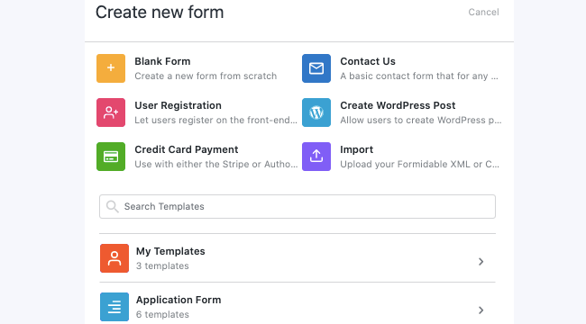
First, go to the Formidable section of the WordPress dashboard and click the Add New form button.
Here, you'll find the option to load a template. Select the Contact Us form template and get to work personalizing it.

** Pro Tip ** If your form is sales focused or a point of first contact, keep it as simple as possible. Studies show that the longer the form, the fewer users will fill it out. Only ask for the information you need for the immediate request. You often only need a name, message field, and contact number or email address.
Forms aimed at existing customers (like tech support forms), or forms where there is a perceived value in giving additional information (like quotation calculators) can be longer without affecting response rates much.
For this example, I'm going to create the simplest of contact forms aimed at the initial contact with a potential customer. This form includes name, email address, contact number (optional), and a field for the message.

First, hover over the "Subject" field and "Website" field that were included in the contact form template. Click on the three dots that appear on the right and click Delete to delete both of these fields.
Technically separate fields for first and last name isn't required, so in some circumstances the two can be combined.
Next, add a field for a phone number. This will not be a required field as many people don't like giving out their contact number immediately. But if the query is to request a call back, a phone call response is much more likely to make an immediate sale when compared to an email response.
Finally, because I already have other spam protection in place on my site and I want to keep my form as user friendly as possible, I'm going to remove the reCaptcha field.
*** Update *** Invisible reCaptcha is now fully supported by Formidable forms!
Customize the contact form with a three-column layout
Now that the form fields are all setup, it's time to think about the layout. With my background in web design, I've learned to hate random white space on a page, so I want a layout that will be compact, easy on the eye, and fit in perfectly with my other page elements.
I love the "call me back" forms that you see more and more on modern websites because of this simplicity. A single line split into thirds, name - number - submit button. It's super sleek and looks great. But it's much harder to achieve this sleekness with a large paragraph text field. On many modern widescreen themes it just looks too big if you have this element full page width. I like to use sections to achieve a minimalist layout.
Add two section fields to your form and drag them into a single row and remove the section titles. Hover over the row with the section fields, and click the three rectangles that appear right above it. Click Custom Layout and set the first to take 8 and the second to take 4. This creates a 2/3 and a 1/3 section.
Next, drag the First Name and Last Name fields into the first section, the Contact Number and Email fields right below it. Then add the Message field in the second section. Then, adjust the Message field to be 4 lines high instead of the default 5. Now everything lines up evenly.
The final step is the submit button. Setting this to 100% width gives a symmetrical, minimalist feel that is nice and compact and easy to fit into a one page design.

Make the most of your contact form actions
Just because your contact form looks minimalistic, doesn't mean the form actions need to be basic too! There are three main steps you can take to maximize the impact of your form and take the process of personalizing the contact form template to the max.
- Set your form redirect. Bring users to a page that displays a thank you message along with a selection of your latest products or special offers. Turbocharge your sales by including a time limited coupon code on this page too.
- Send an automatic, personalized thank you email. Instead of a boring "Thanks for your message - we'll get back to you" response, use a form action to say thank you. Use the first name field to personalize the subject line and text. Include details of special offers, useful information, and value added promotions in your message.
- Add the user to your MailChimp list using the MailChimp add-on. A highly qualified email list is one of the most valuable marketing resources you can have, so don't miss any opportunity to build your list!
More form templates to share
The Formidable team has built loads of other custom form templates. We'd love to hear your suggestions for additional online form templates to add to this list.
Not yet using Formidable Forms? Learn more about how we have the most advanced online form builder features or go ahead and get started!

A post with some tips on customizing forms to look similar to Typeforms would be good.
I've used the paged forms well, but I think some extra CSS styles would help bring the forms to life a little more.
Would be great if your example form above had screenshots of the process you go through. Or perhaps even a YouTube video tutorial showing the exact process. Great post Nathanael.
Hi Horizontal and three columns forms proved to get more response from applicants ... great features any way