Learn contact form best practices to design high-converting forms that engage users, increase submissions, and drive more qualified leads for your business.

Approximate read time: 8 minutes
Are your contact forms bringing in useless responses? Or, even worse, no responses at all?
If so, it might be time for a makeover.
Creating high-converting forms is more than just asking for a name and email address. It's about designing an easy and engaging experience for visitors. And that's what we'll do today.
In this post, we'll share nine best practices to help you craft contact forms that don't just collect information. They turn casual visitors into potential customers. And with the right strategies, you can make sure your forms are as effective as they are inviting.
So, let's dive in and see how to design contact forms to convert.
9 Contact form best practices to use today
1. Use a well-designed layout
A well-designed layout is essential for making your contact form user-friendly.
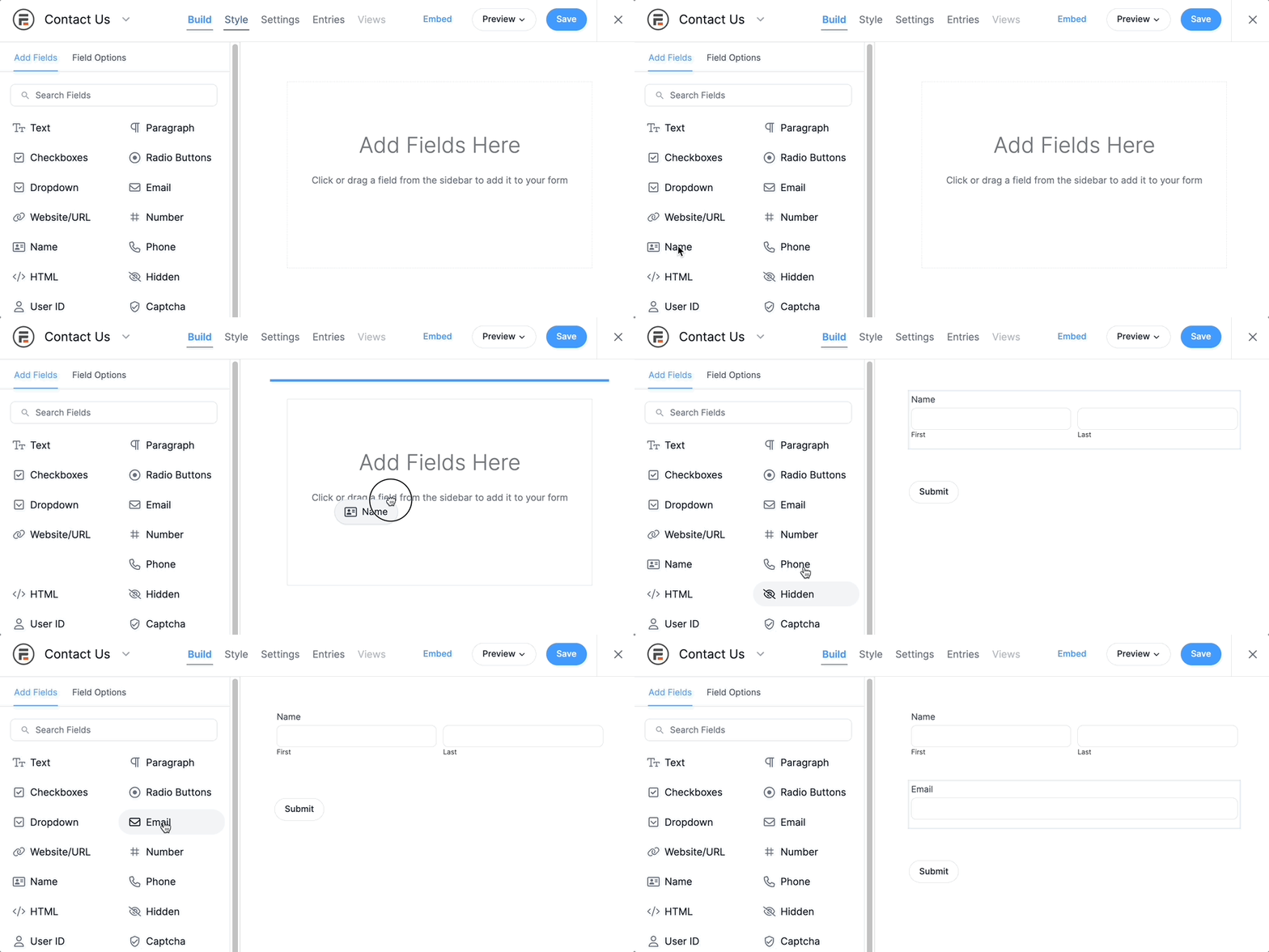
Stary by arranging the fields in a logical order that aligns with how users share information naturally. For example, start with a name field, an email field, and then a message field. Grouping related fields together makes the form clearer and easier to follow.

Use headings and sections to break up longer parts of your form into easier parts. Whitespace is your friend, so use it. It prevents the form from feeling cluttered and overwhelming. It guides the eye naturally from one field to the next.
Remember, the goal is to make the form easy to understand and follow. Contact forms have some of the lowest conversion rates of any form.
So the easier it is, the more you can raise that number.
2. Limit the number of form fields
Too many fields can be overwhelming and turn people away.
Reducing the required fields will help create a cleaner form and prevent the user from being overwhelmed. In a study by HubSpot, forms with three fields performed the best but started to drop with each additional field.

Limit the number of fields to no more than 5, and make sure you have the correct tab order.
You should also consider building a conversational form that guides your users through the survey one question at a time. This reduces distractions and keeps the form fields to one per page so users don't feel overwhelmed. If a form only has one or two fields, you may consider using it as an inline form.
3. Determine the best form placement
Where you put your form on a page significantly changes how effective it is.
The key is to align form placement with user intent and behavior. For example, placing a form "above the fold" (the portion of the page visible without scrolling) immediately gets attention. This is perfect for landing pages with a simple form to collect contact information.

On the other hand, placing the form near the end of a blog post or informational page may be a better choice. When visitors reach this point, they've engaged with your content and might be more likely to take action, including signing up for a newsletter.
Also, try A/B testing your form placement to find where it works best. It may differ depending on the page or post. So it's worth exploring all the options.
Read more: 6 Ways to Increase Conversions in Your Email Sign Up Form
4. Optimize the form for mobile
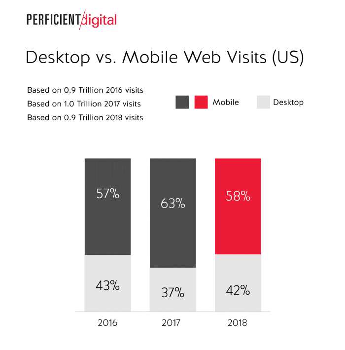
With most web traffic now coming from mobile devices, optimizing your form for mobile users is crucial. A responsive design ensures your form automatically adjusts and displays correctly, no matter the device.
Start by using a single-column layout, which is easier to scroll through on narrow screens. Also, check out that tap targets, like buttons and form fields, are large enough to click easily.

Use mobile-friendly options, such as showing a number keypad when a phone number is needed or an email keyboard for email fields. This helps people fill out forms faster and improves the overall user experience.
Last, test the form on different devices to ensure everything works correctly. This way, you catch any errors before it's live.
5. Use the best label and color for the CTA button
The button on your form is arguably the most important part.
After all, it's what users click to submit after all. So, it's important to choose the label carefully.
Instead of just saying, "Submit," try using action words like "Sign Up Now" or "Get Your Free Guide." These words tell people exactly what they're doing and are much more compelling.
The color of your button matters, too.
Pick a color that stands out from the rest of your form and page. This makes the button easy to spot and more likely to be clicked. For example, a bright orange or green button might be more eye-catching if your website is mostly blue.

This is another case where testing is a great idea, like HubSpot's A/B test. These seem like small changes, but they make big differences in helping users complete your form.
6. Avoid using CAPTCHAs
CAPTCHAs are those tests where you must pick images or type words to prove you're not a robot.
While they help block spam, CAPTCHAs can also annoy people. Many people may leave your form if they find it too frustrating. Moz has researched the effect of CAPTCHA on completion rates. For their three-month test period, spam was reduced by 88%, but they saw a failed conversion rate of 7.3%.

Instead of CAPTCHAs, there are other ways to stop spam.
One option is a Honeypot field or Cloudflare Turnstile. This is a field that only bots can see and fill out. When they do, their form submission gets blocked. The best part? It doesn't interfere with real users because they can't see it.
You can also ask simple questions humans can answer, like "What is 2+2?" These options are simple but also add an extra layer of spam protection.
Ultimately, skipping CAPTCHAs creates a smoother experience that encourages more people to complete your web form.
7. Make the errors clear
People make an estimated 19 mistakes per 100 words. When users type answers into your form, it's an easy opportunity to make one.

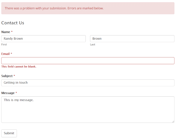
But without a clear error notification, you just cause stress on the visitor. If it's too difficult to figure out, they may move on. So, highlight the problem and place a message near the field.
It can be simple, like, "Please enter your name" or "Please use a valid email." Regardless, make it clear what the user needs to do instead of leaving them to guess.
Clear and helpful messages improve the user experience and boost the chances you get a submission.
8. A/B test to optimize conversion rates
A/B testing is a great way to determine what works best for your contact form.
It involves creating two versions of a form to see which performs better. You might try different button colors, form lengths, or question orders. At first, change one thing at a time, like the headline or submit button label. Then, show each version to visitors and see which performs better.
You can improve your form by building upon it and testing more things using this data. Always test to see what your audience likes and what they respond to.
It's one of the most important things to do to follow contact us form best practices and keep improving.
9. Don't ask for personal information you don't need
People typically do not like to give information such as their phone number and address.
This causes high levels of abandonment. KoMarketing shows that a phone number is the leading information users prefer not to include on a form, at 58%.

This is even truer today as spam calls have become more prevalent. A home address was next, at 53%. If you have questions that only need to be answered based on another field, use conditional logic to build smarter forms.
Ready to create contact forms that convert?
That’s our 9 research-based tips to increase conversion rates in contact forms. Simplifying your contact form, making it easy to understand, not asking for too much information, making it appealing, and making it easy to use will greatly improve the conversion rate of any contact form.
If your business depends on visitors using your contact forms, it’s crucial that the forms are as optimized as possible. These tips are easy to implement and can greatly impact your conversions.
You can even use social proof to build trust!
Read more: How to Build Helpful WordPress Forms That Convert
But we want to hear from you. Have you tried these tips to improve contact form conversions with your Formidable Forms? Let us know about your experience in the comments.
Not using Formidable yet? Want to boost your contact form conversions? Then check out all the great form builder features to see how Formidable Forms can help you increase your form conversions.
 How To Add a Google Map to a WordPress Contact Form [Free!]
 How To Save Form Progress in WordPress [4 Steps!]
Thanks for sharing the real results! I know how annoying captcha can be and how it affects the conversion results. However, it is a big help in reducing spam. Can you share an alternative way to reduce spam without using captcha?
Formidable Forms also includes a built-in honeypot spam filter and optional javascript spam filtering. These two options have zero impact on the end user, but do a great job at reducing spam.
Thank you for this helpful article...
Nice
Helpful Article...
Thanks for the informative article! Very helpful. Can you please tell me how true it is that multi-step form conversion statistics are very low? What would you advise if you need to get a lot of information from the user? Thank you!