Creating a multi-column form in WordPress doesn’t have to be complicated! We’ll show you the easiest way to place fields side by side in a smart grid layout.
A WordPress multiple column layout designer can be a useful tool. This formatting can help make big forms neater and more compact. However, some form plugins make it a bit difficult to place fields side by side.
Fortunately, Formidable Forms works differently. By using our super easy layout builder, you can quickly create stunning column forms.
In this article, we’ll discuss why you might want to build a column form. Then, we’ll show you how to create one in three simple steps. Let’s get started!
Why you might want to place fields side by side
Having the option to place fields side by side gives you more flexibility with your forms. In fact, some data might look best in a column format. You can use side-by-side fields to create a highly organized form that’s easier to navigate. This may be the case with an online application form or a city state form, for instance.
Furthermore, beyond forms, columns and grids are helpful for data visualization and to display real estate listings. A vertical layout can communicate property information more clearly.
At Formidable Forms, we believe that columns should be easy to use, which is why we designed a user-friendly layout builder.

Our team has built an intuitive editing experience that is easier than adding HTML form fields side by side. By learning a few simple steps, you can become a pro at using this flexible tool – no custom CSS required!
How to create a responsive two column form in WordPress
Let's show you how to create beautiful, responsive, vertically organized forms in just three steps. Or, learn how to create an inline form.
Step 1: Create a new form
First, you'll need to create a form. Go to Formidable → Forms → Add New:

Then, you should see a pop-up. This will ask you if you want to start from scratch or use a form template.
We recommend you start with one of our templates, which come pre-made with essential fields. You'll see a different number of options depending on your Formidable Forms plan. Here are a few examples:
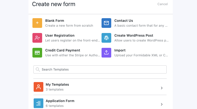
Once you've selected an option, name your form and click on Create. This will launch the editor.
For this walkthrough, we decided to use the Testimonial form template:
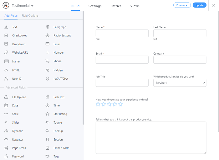
However, feel free to use whatever base will help you get started. For example, if you plan on using pricing fields, you could choose the Credit Card Payment form template instead.
Step 2: Place fields side by side
Next, you'll need to add your fields. If you started with a template, you may already have most of them ready. However, you might want to customize your form with other options.
To add new fields, simply click on an option from the left-hand menu and drag it over to the right side. You can place it wherever you like.
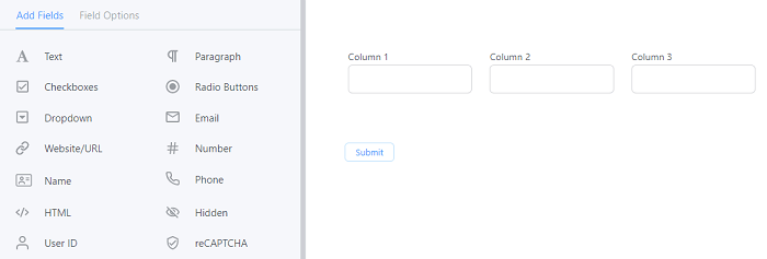
Dragging a field directly next to another one will place it in the same row. If you do this several times, you can create columns.
Let's say you want to know how to make 3 columns in WordPress. All you have to do is drag the fields next to each other in a single row, as shown below:
You can also move existing form fields side by side. To do this, hover over a field. Then, select the arrow icon in the upper right-hand corner:
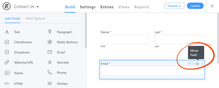
Now you should be able to hold your mouse down and drag that field next to another. For instance, we've rearranged our testimonial form into three columns:

Advanced options for multi-column forms
However, this isn't all you can do with columns! Consider using our advanced options, too.
For example, using Section fields can be used to create column forms without gaps from larger fields:

Or, shift-click, command-click, or control-click on multiple fields or rows. Once you've got more than one field or row selected, you'll see bulk options at the bottom of the page. Here, you can create rows even faster, without manually moving each field. (Hint: You can bulk delete fields this way too!)

Step 3: Change your column form's proportions
In addition to creating columns, you can also change their proportions. Thus, it's easy to design a form with unique formatting. Plus, it'll always be automatically responsive for every screen size.
To get started, select a field and click on the columns icon to access the Row Layout settings:
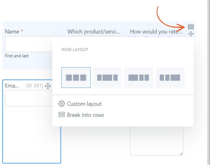
From here, you can click on one of the presets to arrange a row of columns in that order. You can also select Custom layout, which will enable you to customize the proportions to your exact needs:
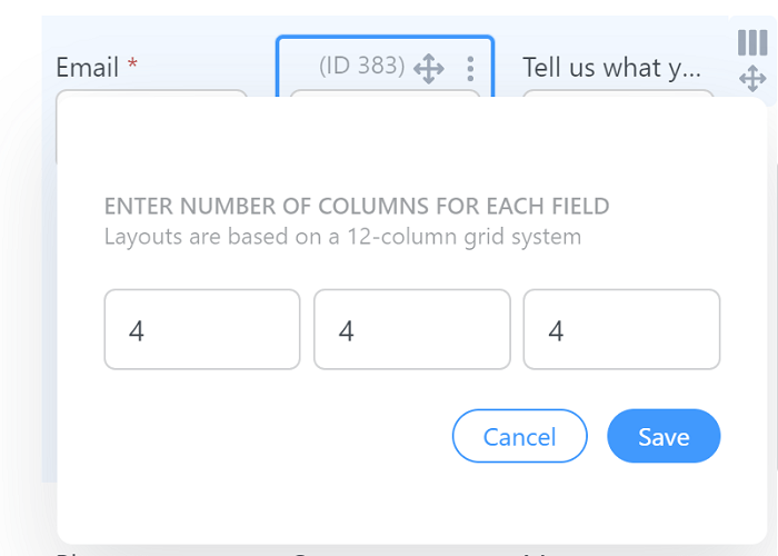
Our layouts work on a 12-column system. Thus, if you want the columns to take up the whole row, the total of all your numbers should be 12.
Enter the proportions you want, then click on Save. If you want your columns to be equally sized, repeat this step with the same number for all rows.
For reference, here's one of our testimonial form layout examples, but with the last column made a little larger. We entered a 3, 3, 6 pattern:

As you can see, including proportions in your column form can help you create dynamic styles. Consider trying out a few different combinations to find one that best fits your theme!
Wrapping up
Sometimes, adding a few columns is all it takes to make your form look more professional. However, some plugins make the process difficult. Fortunately, you can place fields side by side with ease using the best WordPress form builder.
In this article, we covered three steps to build columns in your forms:
- Create a new form.
- Place your fields next to each other.
- Consider using specific proportions.
Columns aren't the only feature that Formidable Forms has to offer. Check out a few other ways it can help you style your forms!
 9 Contact Form Best Practices for High-Converting Forms
 7 Excellent Multi-Step Form Examples To Inspire You
 Beautiful Contact Form Design in WordPress (with Examples)
Looking good.
My only regret is that I am now itching to redo all my forms.
Thanks for the kind words. Creating new forms is much more enjoyable now, so I totally get what you mean.
This is very good, but when you are going to fix the movement of inserting inside sections, that micro space between placing the field in the section or outside it is horrible. ?
Hi Naiara,
Thanks for your feedback, we are looking into this issue and will work on a fix for it.
I've enjoyed this new feature - and so have my clients. Way easier to show someone how to drag and drop a field than to explain what a class is and why you need to add a .first etc.
However some forms that were created the old way, seem to have messed up when one of my clients has moved the fields around with drag and drop. All of the fields look like they are in two columns in the editor (It looks like the upgrade worked), but they don't go into two columns on the frontend. Should they just remake the form in this situation?
Hey Brendan,
Thanks for letting us know about this issue one of your clients is seeing. I haven't seen any other reports of this behavior, but we'd love to get more information so we can work on replicating or finding a solution to this issue. Could you please contact us from our support page so we can get those extra details and get to the bottom of this issue.
This new functionality to be able to use drag and drop to create columns for forms is a really nice feature to hand over to clients. Good stuff
Thanks Daveed...Drag and drop forms are one of the biggest needs in today's website building, so we are glad that you and your clients find this feature helpful.
This was a major factor that made me switch from my old form plugin many years ago. I've never looked back.
Glad you have found a home here. We are happy to have you and thanks for commenting.
These capabilities make forms both functional and attractive. It is fun to be able to build forms the way you want them.
Creating columns using drag and drop is a really great feature. Keep it up!
I commented on the drag-and-drop post but I'll say it here too... the ability to build forms and handle layouts by drag-and-drop is huge. Super useful vs having to remember the CSS tags to do quarter/half/full etc... Good work!
You guys make this so easy and it's extremely appreciated!
You're welcome! Our goal is to make building forms easy without sacrificing functionality and flexibility. Glad you are enjoying the plugin!
I used it for a multiple solutions and it's the best form solution for WordPress. I used others, but none like this!
Great explanation! Still adding a lot of Value to my Content and even more know!
This feature has been a game changer for me making my surveys more beautiful and alongside the new likert feature has resulted in higher completion rates! Thanks so much!
Great tutorial.
This is an interesting new feature that I have started using on a couple of forms. I am sure it will take some experimenting to make it second nature, but the tutorial helps.
Looks amazing and so easy to use. Thumbs up!
Thanks for the tutorial. How do we make a five column (i.e. a column per weekday)? If I put 2,2,2,2,2, then it just makes the last one wider (4), which looks terrible.
Hi there,
Our system uses a 12-column grid, so 5 columns don't really work in that system by default. If you would like to contact our support team, we are happy to look more closely at your site and see if we can find a suitable solution for you.
i use 2 fields with 2 columns layout but on mobile just appear 1 column how can i have with with 2 columns on mobile too
example
i want on mobile
name: lastname:
but i got
name:
lastname:
Hi there,
Generally, the recommended responsive layout for phones is to have all fields take up 100% width and not be side by side. This helps with usability.
If you wanted to override these responsive, mobile best practices, you would need to do so using custom CSS.
If you have an account, you can reach out to our support team and they can help point you in the right direction.