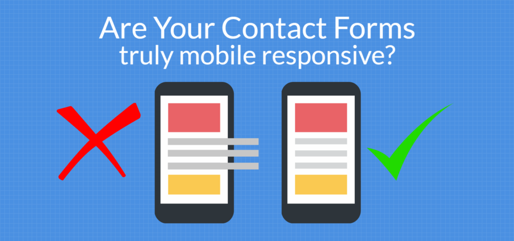
If your WordPress site isn't fully responsive, it's time to catch up. Learn 5 easy steps to make your WordPress site more mobile-friendly with responsive contact forms!

What makes a responsive contact form?
Are you reading this blog post using a computer? If you are, you can test out the responsiveness of this page. Size down your browser, and watch as the page changes and responds to your screen size. Every aspect of the page either scales down or is removed to avoid the dreaded horizontal scroll bar.
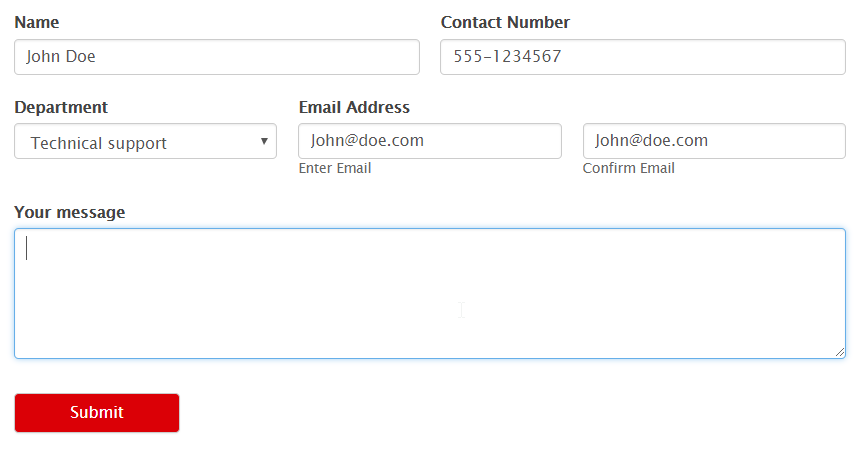
A responsive contact form works the exact same way. Check out the form at the very bottom of this page to see it in action. All the fields in the form size down so they don't reach past the viewable page. All the fields in your contact form scale right down to fit in your hand.
Read more on contact form design (with examples)!
Is your WordPress contact form responsive?
It is essential to have a responsive contact form on your WordPress site. If you've had an online presence for a few years now, you will be aware of just how much the internet is changing. It's not just about styles & features. The big revolution is how many different devices can be used to browse. While most websites are mobile responsive these days, we still see a lot of contact forms that are stubbornly static.

Have you gone to great lengths to make your website mobile-friendly? Did you double check your forms? Do it now! Grab your phone, a tablet and full size computer too if you can. Load up your website on all three. Or even just scale down your browser window on your computer to see if your pages scale down.
Compare your forms on different devices and try a test submission too. It's possible for a form to look great on a mobile device, but it may be hard to use if the design isn't properly touch responsive.
Failed the responsive contact form test? Don't panic!
If you just tested your site and realized you don't have a responsive contact form after all, here are some quick pointers to help you resolve the issue.
Step 1 - Is your theme responsive?
Since forms are nested within the elements and styling of your theme, if your theme is not responsive then your forms probably won't be either. Load a few pages that don't include forms on different devices. If they don't display right, it may be time to switch to a better theme.
Step 2 - Is your form responsive?

If you use Formidable, you can be sure that your forms are designed from the ground up to look beautiful on any screen. With any other form system, check that it holds up to current standards and looks good on the latest devices. If it doesn't, switch to Formidable for better mobile support.
If you are using Formidable and your form isn't scaling down, then something has been added to the form that is limiting the size. Have you added a wide table inside the form? Or maybe an image that isn't scaling? When one element in the form has a minimum width, the rest of the form can't size down either.
Read more: How to make a responsive table in WordPress
Step 3 - Check page-builder elements
Are your theme and contact form both mobile responsive, but your forms still don't look great? It's time to investigate your page-builder (if you use one). Try inserting your form shortcode into a blank WordPress contact us page without using any page-builder elements. If that form is responsive and your others are not, switching to a different page-builder may be a good move.
Step 4 - Inspect with the browser developer tools

Your browser developer tools can be a huge help with figuring out styling issues.
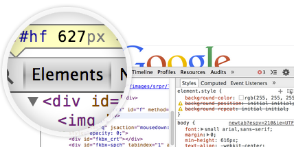
Right click on your page and select "Inspect". Here you can see the CSS rules that apply to each element of your form. A common issue we see is field paddings that look great on big screens. But on small screens, these are so large that the field text is hidden completely.
With your browser tools, add "display:none" to any element on the page that might be the responsive block. See the "element.style" section in the screenshot? That's where you'll add display:none. When you hide the offending element, the page will resume scaling. Once you find the bottleneck, you can either add extra CSS to make it scale or hide it completely.
Step 5 - Check your form on all screen sizes again
If you think you've fixed it, make sure! Test and test again until you are confident it looks great on all screen sizes.
The benefits of a responsive contact form
Mobile responsive contact forms and login forms are a top priority for providing a user-friendly experience.
Ensure your your forms are mobile responsive to increase your form conversion rates and increase customer satisfaction. Ultimately, this should mean your website will generate more revenue! It's worth taking time out of your day to make sure your contact form is working as it should across all screen sizes.
If you use Formidable and are having trouble with your responsive forms, we're here to help. Not using Formidable Forms yet? Join us today.
 How To Create a Contact Form in WordPress In Under 3 Minutes
 How To Add a Google Map to a WordPress Contact Form [Free!]
 How To Embed a Form on Any Website (Not Only WordPress!)
Hello with Vin
I would like to comment on this artical:
I don't want a theme responsive, I want to set it myself, two in a row or three on row or more. If I want 100% I can always do this with this code @media only screen and (max-width: 600px) {width: 100%;}
User friendly is that you have 100% control over your own software.
now i have used the overwrite button but it doesn't work for a meter. even when I take the style out of formidable it doesn't work either and that is because of this code (with_frm_style)
I have the formidable business license, which I specifically bought for the likert scale. Guess what, it isn’t responsive and looks terrible on mobile, and repeats every answer label, making it more tiring to do.
Hi Krystal,
Our likert scale fields should be responsive to mobile devices. It is possible there is some CSS coming from a theme or another plugin that is interfering. We'd love to take a look and see if there is anything we can do to help if you want to create a new ticket in our help desk. https://formidableformscom.bigscoots-staging.com/knowledgebase/