Creating a landing page with a form is easy with our new landing pages plugin. Here's how to set one up in just three quick steps!

Landing pages offer a direct way to connect with your visitors. This makes them very helpful tools for generating leads. However, creating a landing page with form capabilities can be a bit of a challenge.
Fortunately, this isn't the case anymore. Our new plugin, Formidable Landing Pages, is here to simplify the process. By using this tool and following a few landing page design best practices, you can increase conversions and gather more leads.
In this article, we'll cover a few reasons you might want to create a landing page form. Then we'll show you how to build one of your own. Let's get started!
Why you might want to use a landing page
At this point you might be wondering: what is a landing page? To put it simply, a good landing page is a standalone location on your site. It doesn't link to other pages and it exists for one reason only - to accomplish a specific goal.
For example, you might use a landing page to collect email list signups. In this case, you would include a Call To Action (CTA) and a form for visitors to enter their information. That's it.
This focused approach can prevent distractions. If your users only see the form fields, they may be less likely to lose interest and wander away.
You can also use landing pages to deliver products. Creating one to promote an e-book download, for instance, can help boost your conversion rate.
Finally, remember that you're not limited to a single landing page. In fact, you can make as many as you need and they can still be effective. Now you can create countless new landing page forms in less than a minute.
How to create a great landing page with forms
Now that we've covered a few key advantages, we'll show you how to make a good landing page. Before you get started, be sure to have the Formidable Landing Pages plugin installed and activated.
Step 1: Create your landing page form
Let's begin with your landing page form. This will be the foundation of the page. Therefore, you'll want to carefully consider what information to include.
You can start by going to Formidable → Forms → Add New. Decide if you want to use a form template or start from scratch. Then give it a relevant name. Next, you'll see our friendly form builder:
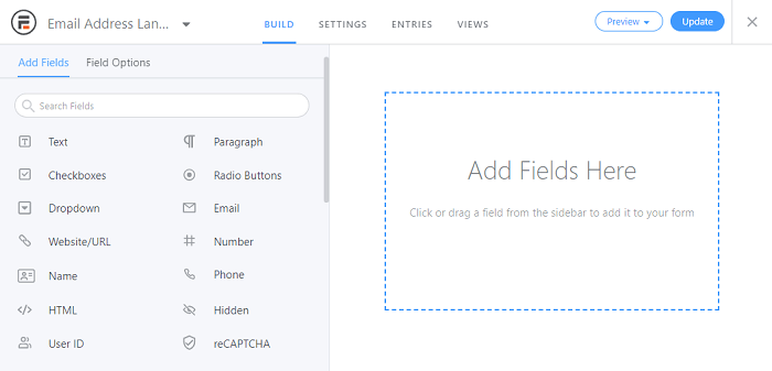
From here, you can drag and drop the fields you want to add from the left side to the right. As we mentioned before, try to create a simple form to keep it as short and focused as possible.
For example, if you're collecting email addresses, you might only use one field. You may want to include another to gather basic information, such as a first name, but we recommend limiting your form to two or three fields at most. Alternatively, a multi-step form with a progress bar could help solve the same problem, by making the landing page form look simple for a longer form.
The same advice applies to your submit button CTA. Try to include one brief, memorable instruction. This can help keep your visitors focused.
Feel free to use the Preview button to make sure your form looks exactly how you want. Once you're all set, click on Update to save your work. Then you can move along to the next step.
Step 2: Customize your landing page settings
Now that you've completed your form, you're ready to turn it into a landing page. Start by switching over to the Settings tab.
After that, click on the Form Landing Page section in the left-hand menu. Then turn on the Generate form landing page switch at the top of the page. You should see a new menu of options:
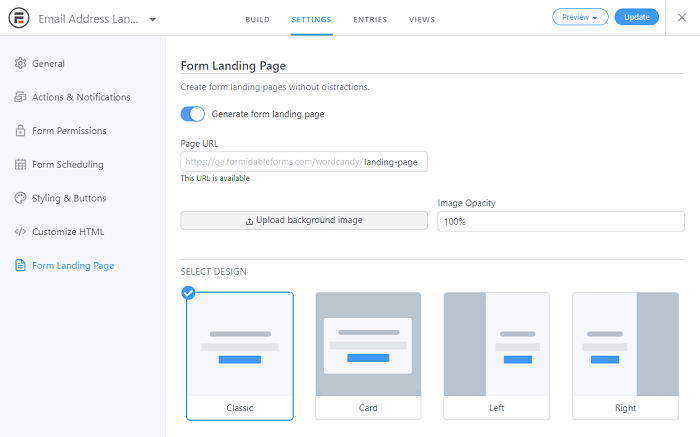
From here, you can adjust your settings to customize your landing page. If you start at the top, you'll see the option to determine the landing page's URL. Just like with your form's title, try to choose a simple, descriptive name.
Moving down, you'll see that you can also upload an optimized background image, which will appear behind your form. You can also adjust its opacity. The lower the Image Opacity percentage is, the more transparent the background will be.
Finally, you can choose the form's design. Classic will make it centered on the landing page. Card will help it stand out. The Left and Right options may be helpful if you want to use a large CTA on half of the screen.
Once you've made your choice, click on Update. To see the result, click the Preview button and select On Landing Page. This will take you directly to the new page.
Step 3: Edit the final landing page content
At this point, your landing page form should be ready. However, you may want to further customize the landing page content around it.
To do so, click on Edit Landing Page on the same settings screen. This will be next to the Page URL setting, and only appears after you've created the page. It takes you directly to the WordPress Block Editor.
From here, you can make changes just like you would with any other page. For example, you might choose to add extra instructions before the form. Additionally, you could even add a few quick bullet points to describe the benefits of signing up.
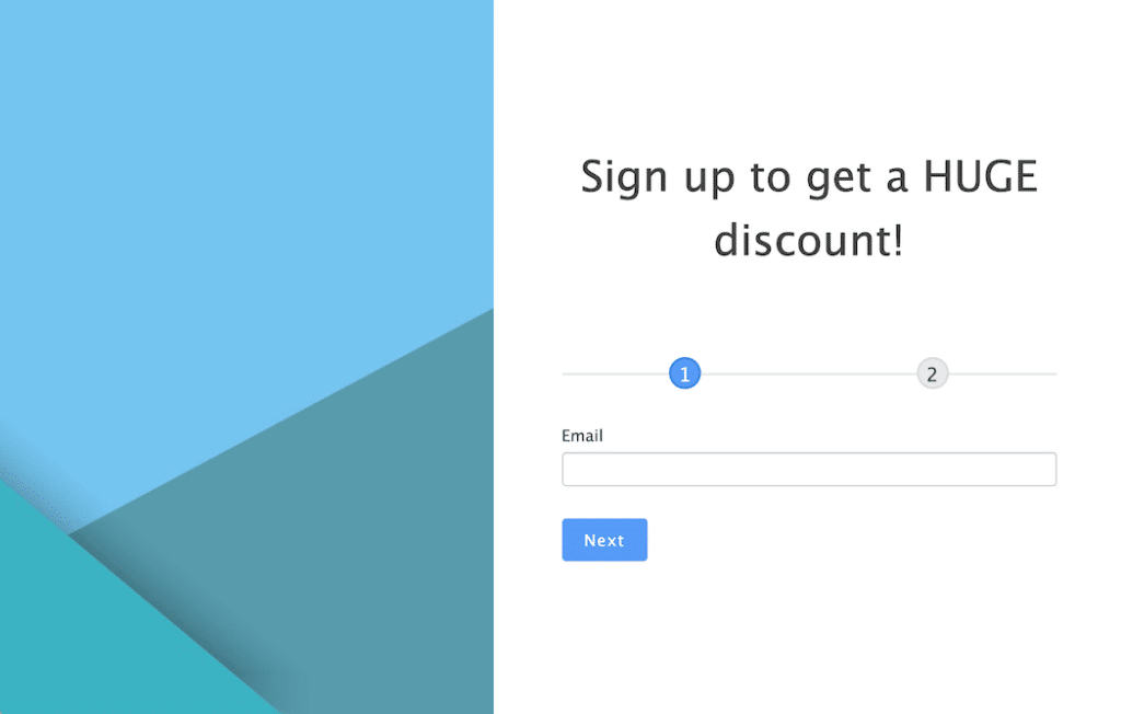
When you've made your changes, click on Update to see your work. In our example, we've added a simple, light-colored background image to help the text stand out:
We recommend that you keep an eye on how each landing page performs. That way, you can return to this editing screen and make changes to this part of your email marketing strategy as necessary.
Conclusion
Landing page forms can be crucial tools for your website's lead generation and conversion strategy. However, making one might seem difficult. Fortunately, Formidable Landing Pages can help you simplify the process and produce a beautiful result.
In this article, we showed you how to build a good landing page with a form:
- Create the form you want to appear on the page.
- Customize the landing page settings.
- Make final adjustments within the WordPress editor.
Formidable offers one of the best WordPress Landing Page plugins and provides an easy way to create targeted web pages. Check out this great new plugin and improve your marketing strategy today!
 11 Best WordPress Lead Generation Plugins To Capture Emails
 How To Sell Services on WordPress [A Complete Guide]
 How To Create a Quiz Funnel [A Complete Guide!]
Leave a Reply