The toggle field allows the user to enable or disable the field by switching between two states, like on and off.


Standard field options
A Toggle field has the following standard options:


- Field type
- Required
- Field key
- CSS layout classes
- Label position
- Visibility
- Conditional logic
- Dynamic default value
Field specific options
In addition to the standard field options, a Toggle field has a few field specific options.
Toggle Labels
Select 'Show Labels' if you would like the 'Active' and 'Inactive' labels shown with your toggle button.

Active and Inactive Labels
Set the 'Active' and 'Inactive' labels for your toggle field when the labels are shown on the page.

Please note that if you leave the default labels, they will not be shown when 'Show Labels' is selected.
Toggle Values
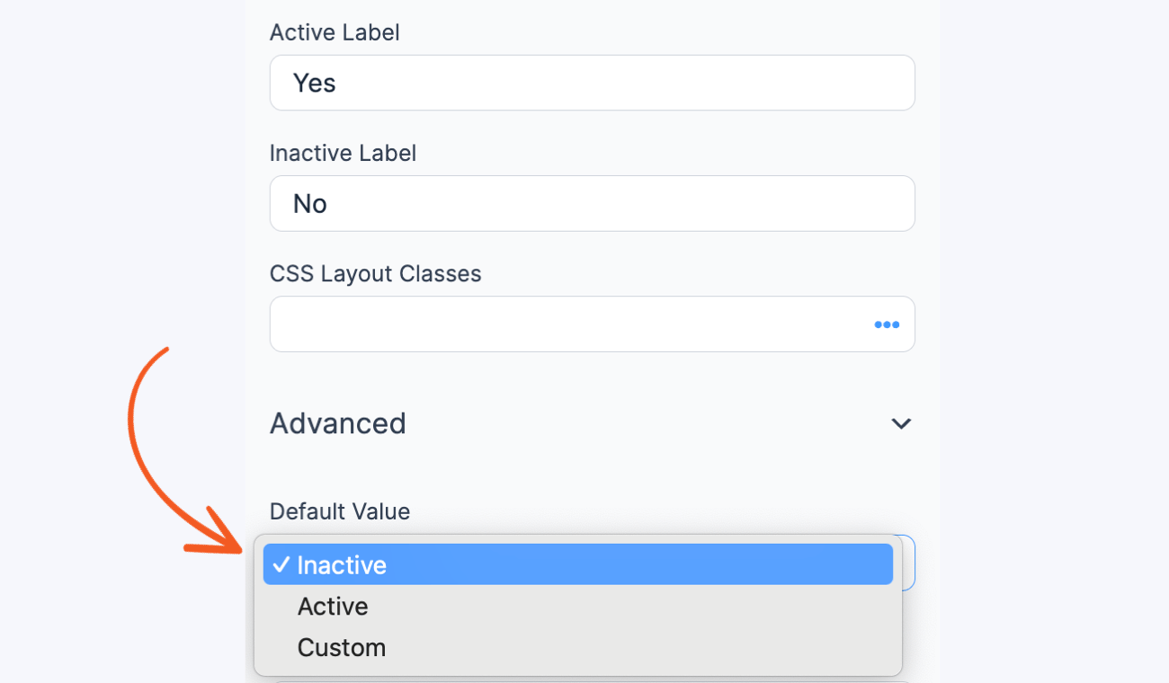
By default, the field is inactive and stores the OFF or Inactive value. If the field is active, the toggle field stores the ON or Active value.
To change the active toggle field as the default value, insert the same ON or Active value in the Default Value box.

Field styling
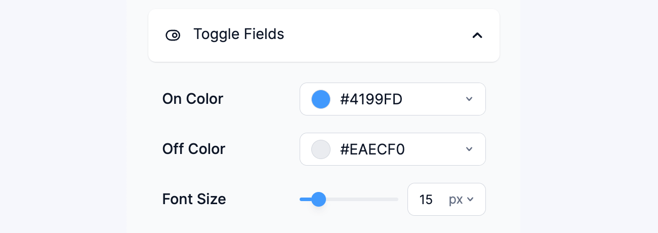
Some toggle field styling is available in Formidable → Styles → Toggle Fields.

To learn more about styling your form, see the visual form styler page.
Display Toggle
By default, only active toggle fields are included in email notifications. If you want to display the value for both active and inactive toggle fields, follow the steps below.
- You will first need to customize your email message.
- To create your conditional, use the insert value box by clicking the (...) icon in the field and selecting the Conditionals tab.

- Set your conditional for each toggle field to show No or another message if the field is blank.
[if 1682 equals=No]No[/if 1682]
Replace 1682 with the ID or key of the Toggle field.

