A Collapsible Section makes a section, or group of fields, collapsible. It is useful when there are several sections in your form and you want them to take up less vertical space. You may use collapsible or standard sections to adjust your form layout or conditionally hide/show a group of fields.

Standard Field Options
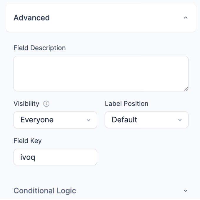
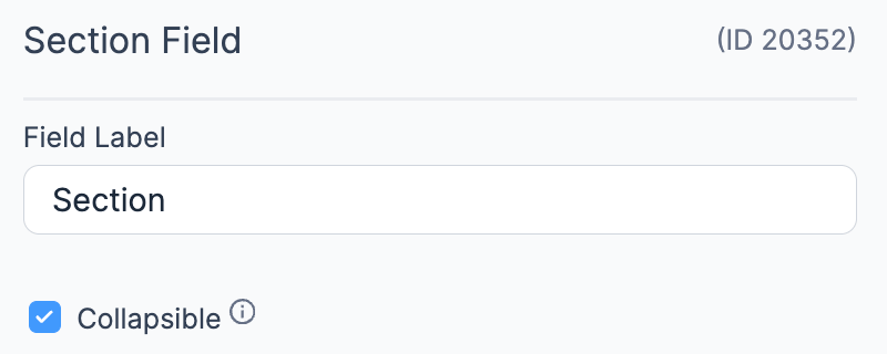
A Collapsible Section has the following standard options:


Collapsible Section styling
Customize the style of your Collapsible Sections by going to Formidable → Styles → Section Fields. Select the Collapsible tab and choose the icons you would like to use for opening and closing your collapsible sections. You may also choose whether to put the icon before or after the section title.
![]()
Set up a Collapsible Section
- If you would like to create a Collapsible Section, click on Section field in the right sidebar and select the Collapsible checkbox option in the field options.

- Drag and drop fields into your Section. Every field that is in the Section field will be collapsible and will appear when the Section Heading is clicked.

Create an accordion
If you are using Collapsible Sections and would like only one section to be open at a time, turn it into an accordion by following the steps below. By default, this will make it so the first section is open when the user comes to the form. See an example of an accordion here. Please note: Sections cannot be conditionally hidden/shown when they are in an accordion.
- Go into edit your form. Open the Field Options for each of your Section Headings and make sure the Collapsible and option is NOT checked.
- Go to Settings → Customize HTML.
- Add this to the Before Fields box:
<script type="text/javascript">jQuery(function($) {$("#accordion").accordion({heightStyle:'content'});}); </script> - Find the box for the first section heading field. Remove the default code and replace it with this:
<div id="accordion">
<h3 class="frm_pos_[label_position][collapse_class]"><a href="#">[field_name]</a></h3>
[collapse_this]
<div class="frm_grid_container">
- Remove the default code for all the other section headings and replace it with this:
</div>
<h3 class="frm_pos_[label_position][collapse_class]"><a href="#">[field_name]</a></h3>
[collapse_this]
<div class="frm_grid_container">
- Add:
</div></div>
to the bottom of the the last field in your form (not the After Fields):
- To load the javascript for the accordion, add these lines in your theme functions.php or in the WPCode plugin.
wp_enqueue_script( 'jquery-ui-widget' );
wp_enqueue_script( 'jquery-ui-accordion' );
- If you don't like the way it looks, you can change the calendar theme in your Formidable → Styles in the Date Fields tab. The accordion styling will match your selected calendar theme if you have a date field in your form. If you don't want a date field in your form, add a date field and set the Visibility to Administrator.
- (Optional) If you don't want your accordion to match your calendar theme, add this custom CSS in your Formidable → Global Setings → Custom CSS.
#accordion .ui-state-default a, .ui-state-default a:link, .ui-state-default a:visited {
	color:<?php echo esc_html( $defaults['section_color'] ); ?>;
	color:var(--section-color)<?php echo esc_html( $important ); ?>;
	text-decoration: revert;
}

#accordion  h3[class*="frm_pos_"], #accordion h3[class*="frm_pos_"].ui-state-hover {
	font-size:<?php echo esc_html( $defaults['section_font_size'] ); ?>;
	font-size:var(--section-font-size)<?php echo esc_html( $important ); ?>;
	margin-bottom: 0;
}

#accordion .ui-state-hover, #accordion .ui-state-default, .ui-widget-content .ui-state-default {
	border:<?php echo esc_html( $defaults['section_border_width'] . ' ' . $defaults['section_border_style'] . ' ' . $defaults['section_border_color'] ); ?>;
}

#accordion .ui-widget-content, #accordion .ui-state-default, .ui-widget-content .ui-state-default {
	background: none;
}

#accordion .ui-icon {
	display: none;
}

#accordion .ui-state-active, #accordion .ui-widget-content, #accordion ui-state-hover {
	border: none;
}


