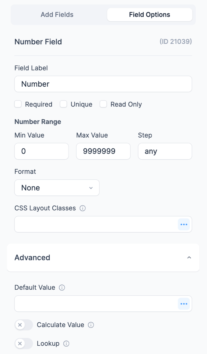
A Number field is used for entering numbers and will only pass validation if the value entered is a number that falls within the designated range and step settings.

Standard field options
Number fields have the following standard options:


Field-specific options
In addition to the standard field options, Number fields have a 'Number Range' option. Read more about this option below.
Number range
This option is for browsers that support the HTML 5 number field. Enter the minimum and maximum values for your number field.

The step setting will affect the types of numbers that are accepted. If you want to allow all numbers, including decimals, enter 'any' in the 'step' box.
- If you want to accept only whole numbers, enter 1 in the 'step' box.
- If you want to accept decimals, e.g. only 2 decimal places, enter .01 in the 'step' box.
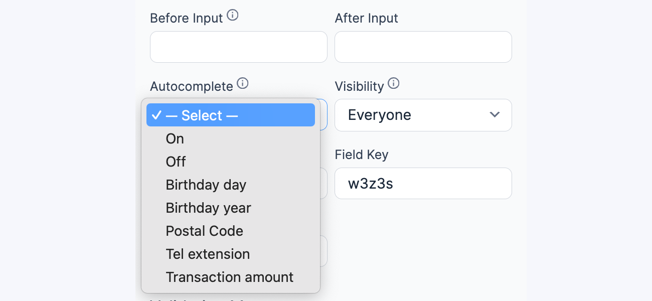
Autocomplete attribute
This field setting allows you to set an autocomplete HTML attribute. The autocomplete attribute asks the browser to attempt autocompletion based on user history. Read more about the Autocomplete attribute.

The options give context to autofill features in browsers. It is restricted to numbers, such that those options like Birth year at least but not Birthday. Note: The autocomplete attribute will be used in favor of an attribute found in custom HTML.
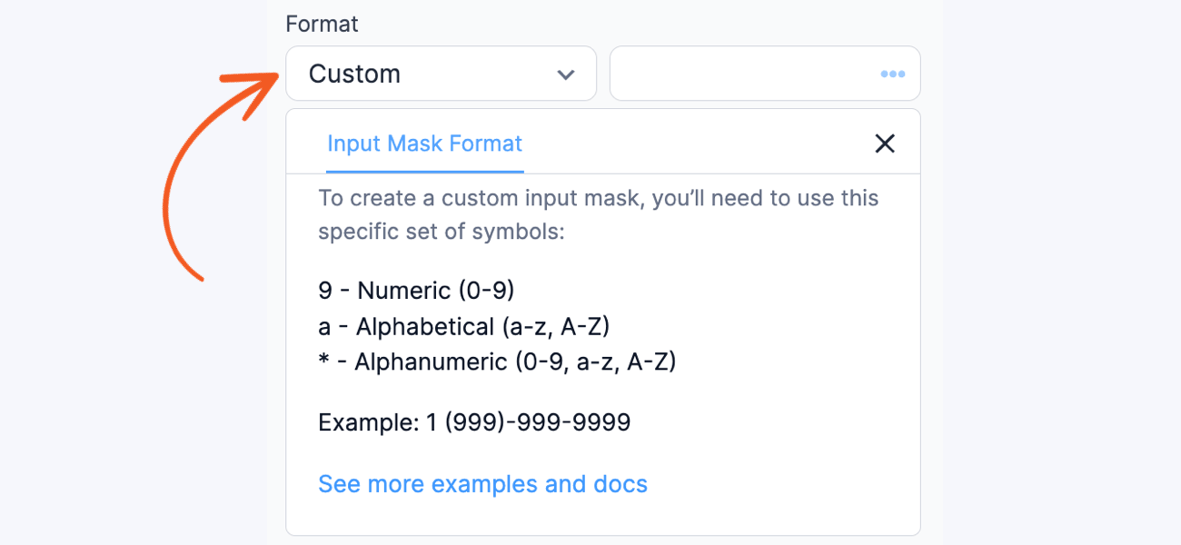
Custom Format
Select this option if you need a specific custom format. You can enter the format you want in the field next to it.

When you turn on the Pro version, you can use the input mask, which is a premium feature. If the input mask has a value, choose this format for existing forms. For more help, check the guide on customizing the format with an input mask.
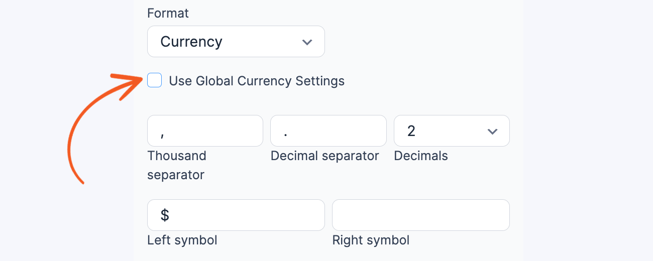
Currency Format
Show the number in the field as currency. It will follow the currency format set in Formidable → Global Settings by default. This format includes two decimal places and a currency symbol. Additionally, you can customize the thousand separator, decimal separator, and number of decimal places and choose your preferred currency symbol.

When you type in a field, the currency formatting will be applied immediately. For example, if a user types This item will cost 5000 it will appear as This item will cost $5,000.00.
Default values and field icons
You may set a dynamic default value in your Dropdown field. If you would like to retrieve a value from an entry see the Get a Value From an Entry page. If you would like to set a default value with one of our dynamic shortcodes, see the Default Values page.
The default value icons can be used to specify whether the text in the box on the form builder page should be a default value or a placeholder. Learn how to set a default value, and how to set a placeholder in a text field.
Field action icons allows you to duplicate, delete, and/or move a field on the form builder page. See field action icons for more information.
Display Number fields
Display the value submitted in a Number field in a form's confirmation message, email, or View.
-
Display value
Display the value submitted in a Number field.
[x]
Replace x with the ID or key of the Number field.
-
Decimal places
Determine how many decimal places should be included in the displayed number.
[x decimal=2]
Replace x with the ID or key of the Number field.
-
Decimal point
Determine which character should be used as the decimal point in the displayed number. By default, this will be a period.
[x dec_point="."]
Replace x with the ID or key of the Number field.
-
Thousands separator
Determine which character should be used as the thousands separator in the displayed number. By default, this will be a comma.
[x thousands_sep=","]
Replace x with the ID or key of the Number field.
-
Display number as currency
Format the number using the currency selected in the Formidable → Global settings. By default, this includes two decimal places.
[x format=currency]
Replace x with the ID or key of the Number field.
Additional customizations
Insert commas as thousand separator
To automatically insert commas as thousand separators while the user types in a number, see this example to add commas to a number.
Add Plus/Minus button
To increase or decrease the numeric value displayed within the input field, see this example to add a plus/minus button.
