The Customize HTML settings allow you to customize the HTML for individual fields in your form. These settings can be found by going into your form and selecting Settings → Customize HTML. This gives you access to the HTML for each field in your form, excluding certain field types.

Form Classes
If you would like to add a CSS class to your form, go to your Form Settings → Customize HTML. In the Form Classes box, insert a CSS class name.

The class will be added to the form tag. If you would like to add multiple classes, separate each class with a space.
Show success below form
By default, the form success messages shows above the form. If you would like the message to show below the form, add frm_below_success in the Form Classes box. Please see the frm_message_placement hook for further customization.
Remove success message styles
In some cases, the form success messages is used to show a response rather than the typical success message. If you are showing the form with the success message, you can remove the green styling. Add frm_plain_success in the Form Classes box.
Customize fields
Each field in your form has a corresponding box in the Customize HTML settings which is populated with the HTML used to design that field. You can move the field description, hide option labels, add input attributes, etc. by adding HTML or CSS to the boxes. The buttons in the Customization panel (right sidebar) can be used to quickly add shortcodes to a field.
Move the description
If you add a description to a field, it will automatically appear underneath the field.

If you would like to put the description on top of a field, follow the steps below.
- Go into your form's Settings → Customize HTML.
- Find the box for the field with the description you would like to move.
- Move this code above the [input] code:
[if description]<div class="frm_description">[description]</div>[/if description]

Other field elements, such as the label, may be moved in this same way.
Edit radio/checkbox options
To edit individual options for radio buttons or checkboxes, follow the steps below.
- Go into your form's Settings → Customize HTML.
- Find the box for the checkbox/radio button field you want to modify.
- Change [input] to [input opt=1], [input opt=2], continuing until you have defined each option for this field. The Single Option button in the Customization panel (right sidebar) can help you break out these options more quickly.

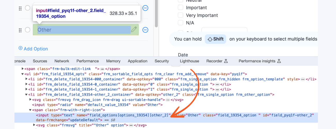
- If you have added an Other option, you can change it to [input opt=other_2] instead. Replace other_2 with the name value in the field found by inspecting the element in your browser developer console.

- You can add images or text between these options as shown below.
<img src="/wp-content/uploads/2013/04/yellowflowers.jpeg"/>
[input opt=1]
<div class="my_class">An assortment of daisies and lillies</div>
- Add as many options as needed.

Hide option label
Follow the steps below to hide a radio/checkbox field's option label.
- Go into your form's Settings → Customize HTML.
- Find the box for the checkbox/radio button field you would like to modify.
- Change [input] to [input label=0]

Add labels to a grid
If you are using frm_grid classes and would like to add a label above each column, follow the steps below.
- Add the following class to Formidable → Global Settings → Custom CSS page or to your theme's style.css.
.frm_grid_header {width:75%;float:right;font-weight:bold;}
.frm_grid_header div{float:left;width:17%;text-align:right;}
You can adjust the width as needed.
- Next, go into your form and add an HTML field above the first row of the grid.
- Insert this code in the HTML field:
<div class="frm_grid_header"><div>Label 1</div><div>Label 2</div><div>Label 3</div><div>Label 4</div><div>Label 5</div></div>
- Add or remove divs as needed so you have the correct number of labels.

There are several other ways to accomplish this same thing. Another approach would be to use a table instead of multiple divs.
Add a dollar sign in front of a field
This option no longer requires HTML changes. Learn how to add a dollar sign.
Add an icon after a field
This option no longer requires HTML changes. Learn how to add an icon after the field input.
Add custom input attributes
You may add custom attributes to a field input in the Customize HTML settings. This allows you to modify your forms so they work better with screen readers (typically for visually impaired users).
- Go into your form's Settings → Customize HTML.
- Find the box for the field you would like to modify.
- Change [input] to [input aria-required="true"] if your field is required and you want to let the screen reader know that it's required. You may replace aria-required="true" with any custom input attribute.
Set cursor location on page load
If you would like to make the cursor appear in a specific field when your form is loaded, follow the directions below.
- Go into your form's Settings → Customize HTML.
- Find the box for the field where you want the cursor to appear by default.
- Change [input] to [input autofocus="autofocus"].
Now, when the form is loaded, the cursor will be in this field so the user can start typing without having to click in the field first. Please note: Some browsers do not support the autofocus attribute.
Control tabbing
Use the tabindex attribute to control where the cursor goes when the user hits the Tab key.
- Go into your form's Settings → Customize HTML.
- Find the box for the field where you want the user to start.
- Change [input] to [input tabindex="1"].
- Find the box for the field where you want the user to go next (when they hit Tab).
- Change [input] to [input tabindex="2"].
- Continue until you have added tabindex="number" to all fields in the order that you want.
Restrict manual entry of date picker
Follow the steps below to force users to select the date by using the date picker and not by manually typing in the date.
- Go into your form's Settings → Customize HTML.
- Find the box for the date field that you want to modify.
- Change [input] to [input readonly="readonly"].
Add a class to a field input
- Go into your form's Settings → Customize HTML.
- Find the box for the field that you want to modify.
- Change [input] to [input class="any-class"]
Turn off browser autocomplete
- Go into your form's Settings → Customize HTML.
- Find the box for the field that you want to modify.
- Change [input] to [input autocomplete="off"]
Add custom div
You can add a custom div to a field input in the Customize HTML settings without breaking the grid CSS style rules by adding a class to the custom div.
- Go into your form's Settings → Customize HTML.
- Find the box for the field where you would like to add the custom div.
- Insert the custom div in the HTML field.
<div class="frm_fields_container">[input]</div>
Automatically convert typed text to uppercase
Use the following example to automatically convert text input to uppercase in a form field in real-time.
- Navigate to your form's Settings → Customize HTML.
- Locate the HTML box corresponding to the text field you want to modify.
- Modify the input tag by replacing the existing [input] tag with the following:
[input onkeyup="this.value = this.value.toUpperCase();"]
Reset a field's HTML
If you would like to reset a field's HTML back to its default HTML, follow the steps below:
- Go into your form's Settings → Customize HTML.
- Find the box for the field you would like to reset.
- Clear out the box(es) you want reset, then save your form.
The box will be refilled with the default HTML after you save your form.


