Looking for a way to make a beautiful, responsive table in WordPress? We have the answer!
With so many ways to access the internet, your users are probably visiting your site on different devices. However, mobile devices with smaller screens may not display your data correctly. Therefore, knowing how to make a responsive table can be crucial.
Fortunately, this process can be simple with the help of our Formidable Forms plugin. Using our latest responsive tables feature, you can create easy-to-read tables for every type of device.
In this article, we’ll explain some benefits of making your formatting adaptable for different-sized browsers. Then, we’ll show you how to make a WordPress responsive table in three steps. Let’s dive right in!
Why you might want to make a responsive table
Tables can be used to organize all kinds of information. For example, they can be an efficient way to build a job board website.
However, the appearance of your table can be affected by certain devices. Smaller screens and browser windows can lead to awkward, nearly unreadable tables or horizontal scrolling. This can negatively impact your site's user-friendliness. But it's not easy to do with standard HTML tables.
That’s why we added an option to make your tables responsive. When you select this feature, each column in your table will display as a full row when the browser window is smaller than 760px wide.
This feature will automatically adjust your site to provide the optimal view. As such, your users will be able to navigate your tables regardless of their device successfully.
Fortunately, Formidable Forms also makes adding this feature simple. With this plugin, you’re just a few steps away from a table that can adapt to any screen size!
How to make a responsive table in WordPress (in 3 steps)
Before you begin, ensure that Formidable Forms Pro + Views is installed and activated, as this is a premium feature. Using our plugin, you’ll choose one of the best WordPress table plugins available.
Step 1: Create a new data source and View
The first step to making a responsive table is building a data source. This is the form that will provide information to fill in your table. You can create a data source by going to Formidable → Forms → Add New:

Then, drag and drop fields to create a form. We’ll be using a basic membership list for this walkthrough. We want the final table to display three columns: a name, an age, and a location. As such, we’ll include each of those fields in our data source.
After you’re done, save your work. You can then collect responses from your site’s users. Alternatively, you can import your entries if you’d like to save time.
When you're done, you’ll need to create a table View. You can do so by going to Formidable → Views → Add New. Then, select Table as your view type.
Select the data source form you made earlier under Use Entries from Form on the next screen. You’ll also have to name your view:
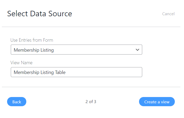
Finally, click on Create a view. This will bring you to the next screen, which we'll fill out in the next step.
Step 2: Customize your table settings
Now, you can start customizing your table's basic settings in the table generator. After the previous step, you should now be looking at the following screen:
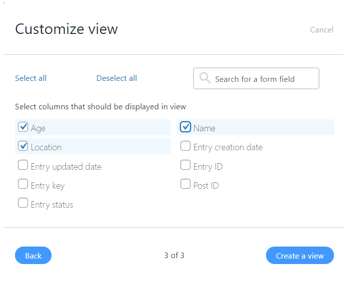
Decide which fields you want to display in your table. For example, if your form asked for a first and last name, you might only want to display the first name to respect your users' privacy.
When you're ready, click on Create a view. You should then see the main editing screen for your Table view:
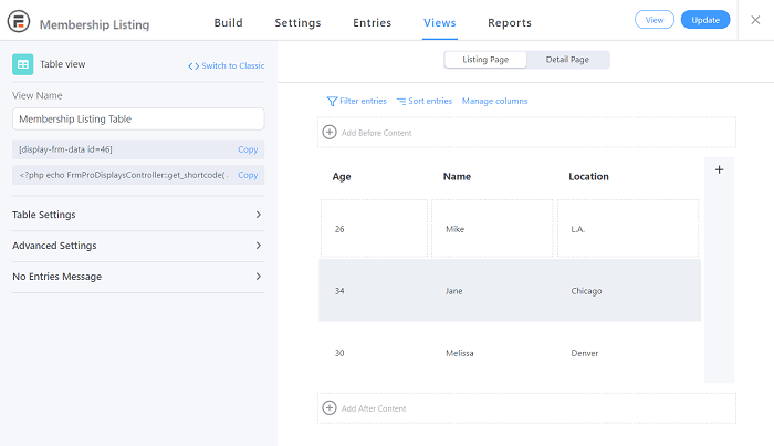
Next, go to the Table Settings section in the left-hand menu. Under the Row Style drop-down menu, you should see a small checkbox labeled Make table responsive:
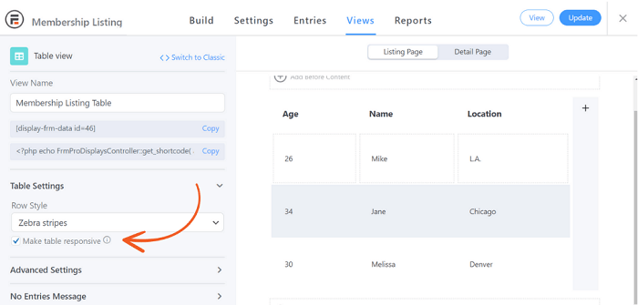
If you don't check this box, your table won’t change to fit your screen size. For example, here’s what our above table looks like on a small screen without the feature:
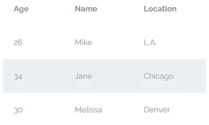
As you can see, the table has kept its original design. This creates an awkwardly wide table and can be harder for those with smartphones to read.
For reference, here’s what happens to the table elements when we check the box to make the same table mobile responsive:
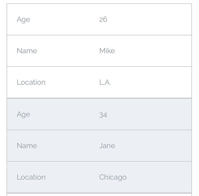
The columns now occupy entire rows, and the table is longer than wide. As such, users who have smaller windows will be able to see each group's information at once easily.
Step 3: Style and publish your table
Now that you’ve made the data table responsive, you may want to add some style elements. For instance, our previous responsive table examples used the Zebra Stripes table row styling.
Your table will adapt to all screen sizes, no matter your styling options. For example, here’s the same data from the above responsive table examples using the Grid style:

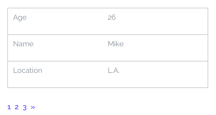
Another way to accommodate mobile users is to add several pages to your responsive design. This can reduce your visitor's need to scroll for a long time. Go to Advanced Settings and enter the number of posts you want per page under Page Size.
You'll now be able to add the table across multiple pages:
We encourage you to consider these settings when making a table. People may view the table on a mobile device. So, no matter what kind of data you’re displaying, responsiveness is a simple way to help more people access your website.
Conclusion
With so many mobile internet users, you might want to consider their user experience when building your website. This can be especially true regarding formatting tools such as table design. Fortunately, creating a responsive table can be a simple process.
In this article, we showed you how to make a responsive table in three steps:
- Create a new table data source and a new view.
- Customize your display settings to include responsiveness.
- Consider other style elements for your table.
Adding a responsive table option is just one aspect that makes Formidable Forms a powerful plugin. Check out some of our other impressive features today!
 The Best WordPress Custom Application Plugin
 7 Best WordPress Table Plugins Compared
 6 Best WordPress Data Visualization Plugins
Leave a Reply