Looking to make WordPress charts and graphs? This post will show you how to create charts in WordPress and display them on your site!

Approximate read time: 6 minutes
Are you working on a WordPress website that needs to make some data shine?
Adding a dynamic chart or graph is a great way to get visitors' attention while also sneaking in some statistics.
But it's tough to make a chart for WordPress, right? It's much easier than you think, especially using the right tool.
In this post, we'll quickly cover what we look for in a good chart plugin and show you exactly how to create charts for WordPress without writing a single line of code!
Use a WordPress charts and graphs plugin
Sure, graphs seem simple at first glance. But behind the scenes, they can be complicated to code.
But why spend hours learning to make an interactive chart from scratch when you can quickly install a plugin to handle the hard stuff?
A good WordPress chart plugin offers the following:
- Ease of use: In a few clicks, your data is turned into eye-catching visuals.
- Several chart types: Pie, scatter, bubble chart... you name it! You can switch it up in a second.
- Frequent updates: Your charts will keep looking good year after year.
- And more time to do what you love!
So, which plugin is the best for making charts in WordPress? The answer is Formidable Forms!
That's right, the best WordPress form builder is the best chart plugin for WordPress.
Now, let's see how easy it is to create charts for WordPress with Formidable Forms.
How to create charts for WordPress

So, it's only a few simple steps to create a chart for WordPress:

You'll need the Formidable Forms WordPress plugin to follow this step-by-step tutorial. The graphs and charts add-on is included in Formidable's Plus plan and above.
If you don't have it yet, click below to get your license! 👇
Once you've installed and activated Formidable, we can start making our chart!
For today's example, we'll use our premiere birdwatching blog, Here Birdie Birdie.

On our website, we built a form for visitors to report the birds they spot. The site then automatically publishes each entry as a blog post. Cool, right?

While this works great for sharing details, many visitors have asked which birds are seen the most.
Instead of fighting with CSV files and Google Sheets to do the math and create visuals, charts, or graphs, let's add a responsive chart to our site showing the number of sightings of each kind of bird.
Step 1: Install the Formidable Forms chart plugin
In the WordPress admin, navigate over to Formidable → Add-Ons. Search for the Charts add-on, then click the blue button to Install, and Activate it.
Great, now on to the fun stuff!
Step 2: Add the Formidable Chart block to your page
Next, let's create the WordPress page/post where we want to insert our chart. For example, we'll make a new page called "Bird Watching Statistics."
In the Gutenberg editor, click the ➕ icon to add a new block. Next, search for "Formidable" and insert the Formidable Chart block.

From the right sidebar, select the form to use as your data source. We should now see some data! 📊

Don't see the data source selector? You may need to open the sidebar by clicking the button in the top right corner of the WordPress editor.
Step 3: Edit your chart in WordPress
We thought a column graph (a bar chart) would work best to show how many times a type of bird has been seen. Lucky for us, that's the default chart type!

The next step in creating our column chart/bar graph is to specify the x-axis and y-axis data sources in the sidebar.
In this case, we'll set the x-axis to "Bird type" and the y-axis to "The number of entries."

Not bad, but it could look better...
Style your chart or graph in WordPress
Let's change the colors of our chart to make things a little flashier.
To do this, go over to the right sidebar. Under Appearance, select the colors you want.

Now, that chart's sure to catch a birder's eye! 👀

But our chart could still be better.
Change the chart type
Instead of a column graph, a pie chart might be a better way to visualize our data. 🥧
So, how can we insert a pie chart in WordPress?
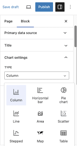
We'll go to the right sidebar and change the Type from Column to Pie. Yep, Formidable Forms works as a pie chart plugin, too!

And there we go! We now have a WordPress pie chart showing the percentage of each answer we received in our form!
For the finishing touch, we'll toggle the Legend button in the sidebar to clarify things.

All that's left is to publish our page. We now have a pie chart on our WordPress site that'll update in real-time when someone submits our form! Pretty fly! 🦅 (We're 99% sorry for that joke).
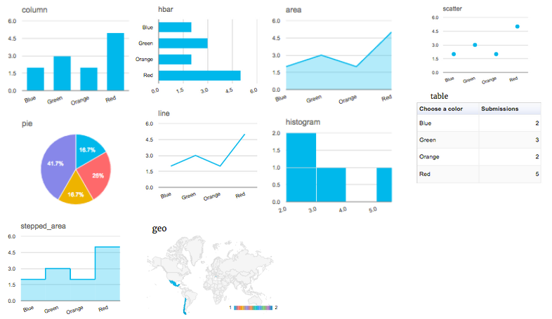
Don't want a column or pie chart? No problem! Formidable's Chart block lets you change between all types of charts and tables in a single click:
- Pie chart
- Bar chart (bar graph)
- Line chart (line graph)
- Scatter plot
- Area chart
- Stepped chart
- Map

And Formidable doesn't stop at building forms and creating charts for WordPress. The pro version also comes with:
- Responsive tables and charts for any theme (including Elementor)
- WooCommerce integration
- Payment gateways
- WordPress application builder
- And much more
One plugin can do all that? Impressive!
Ready to create charts for WordPress?
Don't let WordPress charts ruffle your feathers. Instead, install Formidable Forms and use its powerful data visualization features!
So, forget about searching for a separate graph or chart plugin. To create charts in WordPress, you only need a great WordPress form builder.
But don't forget to follow us on Facebook, Twitter, and YouTube for more WordPress tips and tricks!
 How To Analyze Survey Results Right in WordPress
 How to Calculate Your Net Promoter Score
 6 Best WordPress Data Visualization Plugins
Hi..
I want a website that will allow users to enter a value, and then at the end of the survey the results are graphed for each individual user, not cumulative..
Can you help me?
Graph data can be filtered, so only results for the current user are graphed: https://formidableformscom.bigscoots-staging.com/knowledgebase/graphs/#kb-filtering-parameters
Thanks for the tip!
Hi there,
I have multiple fundraising projects and want to show real time contributions (on each of the campaign pages). Contributions will be processed through PayPal. Can I accomplish this with FF?
Thank you for your time!
Michael
Hi Michael,
Yes - this should be possible using the graphing feature. You could use the data from the donation amount field to build your dataset for graphing.
Can yo show us how? I've been looking for it but I can't find any.
Thanks
Hi, I am looking for a form that logged in users / members can log their temperature into daily and it creates a graph. So I can see their temperature over say 30 days... can this plugin do that?
Yes - Formidable sounds like it would be perfect for your needs!
How could I remove number of submission which is displaying on charts or graphs on mouse over, please guide me.
Hi Nathanael,
Im just getting started with Formidable and have built a piechart diagram showing results, which is great. But Im now trying to build a geography chart, in which I would actually like to show where we work and where we dont, so very binary result really, and preferably a link to a page from the results where there is a positive result. Is this something you have any demos on? I know Im twisting the form format a little as I am using it for presentational content rather than as a standard form showing replies..
Thanks
Would a Geo map based off a country dropdown work for you? https://formidableformscom.bigscoots-staging.com/knowledgebase/graphs/#kb-geo
Well that is actually exactly what I'm trying to set up 🙂
The challenge is to get a way to diplay a link for each country. Ideally I would not get the pop up on hover (e.g. Afghanistan submissions: 1), but instead I could just click the country, and go to a page, where we describe our activities in the country.
Is that at all possible? Or am I trying to get the tool to do something it cannot, I know there are other solutions out there, but I was just setting up other forms and thought this might work for me in this aspect too..
Would you be able to open a ticket in our helpdesk about this? Its probably more than can be covered in blog comments...
Is there any way to ensure that a given field value is always assigned the same color? I have a radio button with 6 options and each option has a color associated with it. Not all of the options will always have values for the count so every time it loads the colors jump around to different values.
That i'm not sure about Brian. If you open a ticket in our helpdesk we could look into this...
The frm-graph shortcode doesn't allow (most) shortcodes to be embedded but I figured out a way to control this by building the correct set of color codes into a string and then passing the string as a parameter into the colors attribute. Sometimes you just gotta get creative 🙂
Hi Brian! I think you have managed to do what I am trying to achieve right now. I have a pie chart where I want to have the slices red for yes and green for no - can you share how you managed to pass through the parameter to graph shortcode? It would be much appreciated!
I am trying to display water quality data from multiple location. We have several schools collecting data and we would like to have that data entered by the students and displayed as a graph or table. The data needs to be searchable by locations and date range it was entered, then displayed as a chart or table selected by the student.
Is this possible with Formidable?
Thanks,
Tammy
Hi Tammy,
Yes, what you describe is possible with Formidable. 🙂
We offer a full 14 day money back guarantee, so you can try it out risk-free and make sure Formidable is a perfect fit for your project.
Hola he seguido tu ejemplo al apie de la letra, en el front donde deberia aparecer el grafico solo aparece el mensaje: no hay datos, que me estaria faltando, tengo la vercion pro del plugin.
saludos
Can you please open a ticket in our helpdesk and our team will be happy to help you with this.
Is there anyway to make the charts less jumpy? I'm using a pie chart but if I scroll over the popup box (that displays the answer for the slice of pie your on) its very jumpy.
Hi Richard,
I see you were able to create a ticket in our help desk for this question. That's great as we can't provide support like this on our blog. We'll get you taken care of from the support desk.
Hi there, new user wondering if you can point me to an example of a stacked column graph shortcode.
Hi, I need to create a score from a form. There are 24 statements. The user ticks the statements that apply to them. I need the system to add up the number of ticked statements and ideally create a % from that e.g. if they tick 12 out of 24 statements that would be a score of 50%.
Then I need to create a chart so that when the user submits this form weekly we can chart their progress with a linegraph. Can I do that with FM? Thank you.
Hi Gavin,
Yes - Formidable can do this. 🙂
Hi, I want to realize the following:
the visitor has the possibility to choose either "yes" or "no" in approx. 8 to 10 lines.
Each line has a fixed numerical value in the respective two columns. If "Yes" is selected, the numbers from the "Yes" column should be added, if "No" is selected, then from the other column.
The sum (always below 100) should then be displayed in a bar. Depending on the sum between 1 and 100, the bar should be colored (red to green, rather red is under 50 / rather green is over 50).
Is this possible with your plugin?
Thank you so much for your help!
Hi Robert,
Can you please ask this question in our helpdesk? https://formidableformscom.bigscoots-staging.com/new-topic/
Thank you.
Hi
I made an order form, now I want to put the graphs that I see in the reports section in a tab in wordpress, but I can't. Can you help me?
I'm not entirely sure what you mean by "tab in wordpress", but the reports aren't designed to be moved or relocated. You can create custom graphs and statistics on the front end of your site. Maybe that would be the best way to accomplish what you are after? https://formidableformscom.bigscoots-staging.com/knowledgebase-category/reports-graphs-statistics/
It would be great to see the chart types expanded from the basics. Radar Charts, Spider Charts, Histogram, Waterfall charts. Things are moving on from these basic charts, and clients are demanding more from the data. At the moment, you have to bypass the included chart to use external charting apps.
This is a comment to entry giveaway 🙂
I tried to use Formidable for a particular, rather niche, use case but it didn't quite work out the way I wanted it to... Although that was when I knew virtually nothing about how WordPress actually works so I'm gearing up for another go at this project to see if I can get everything working with Formidable displaying results based on data coming somewhere else. If I can do that, the charts will be a great feature.
Whoa, yet another feature! You guys never stop. 🙂 This is why I've been using FFPro for years. Btw, the fact that all these new updates never cause issues is super important and very much appreciated.
Happy 14th Birthday ... very much looking to take my upcoming web charts to fly with ease!
I can't believe I didn't know about this feature sooner. Awesome.
This is a fantastic feature. I've been wanting Charts in Wordpress for ages.
OMG! How did I not know about this? I can't wait to have a client that needs this functionality.
This feature looks neat, can´t wait to try it out.
I think things like this that offer an expanded use case for forms are what set this plugin apart. The ability to do math on entries, custom views, charts... it's pretty versatile!
this is a great feature. Is there any setting i can use for better viewing on mobile? it doesn't seem to resize automatically. thanks