In this article, we'll break down the concept of conversational form design and when to use it. We'll also explain how you can easily create a conversational interface for your forms in WordPress.

Ever go to a website, wanted the product they were selling, and then had to fill out a 20-question survey that included your family history and dental hygiene habits to get it?
If you're like many potential customers, you'll start to feel overwhelmed and rage-quit halfway through.
One of the biggest problems with most online forms is that they're not engaging or fun. They can be downright tedious. Especially when they ask questions that seem irrelevant.
But we're here to tell you that web forms can be practical and user-friendly and increase completion rates. So, how do you get potential customers excited about filling out multiple fields of data collection questions?
This is where conversational form design comes in.
In this article, we'll discuss using conversational flow in forms and why this is a smart idea for lead generation. We'll also look at some conversational design examples and discuss when to use these forms.
Let's get to it!
What is conversational form design?
Conversational form design is when you lead customers through a survey or quiz one question at a time.
It usually includes a small box with one question, a text box or set of radio buttons for the answers, and a button that allows users to move to the next question or screen.
To better understand the concept of conversational form design, let's establish a proper frame of reference. Here's what a traditional online survey form can look like:

This form enables you to collect valuable information with only a few questions. It's efficient and should only take a minute or two to complete.
The problem is that the longer and more complicated a form is, the higher form abandonment you will have. They may not even start it if they think it will be too much work.
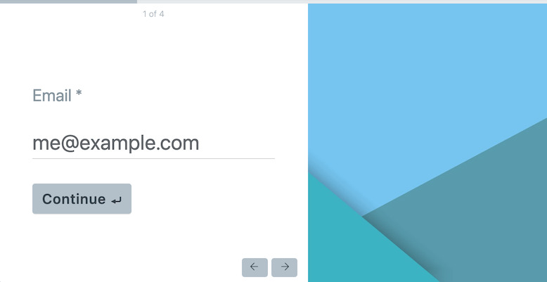
Now, let's take a look at conversational form design. Here's a conversational design example using a survey form:

How does conversational form design work?
When using a conversational forms UI, users move from one screen to the next for each question while staying on the same web page. The goal is to make customers feel like they're having a conversation.
The benefits of presenting forms this way are that it reduces distractions, helps the user not to feel overwhelmed, and allows for questions to be presented with smart or conditional logic. It also makes the user feel like they're talking to someone instead of a robot.
Conversational form examples

Conversational form design is similar to how artificial intelligence performs customer service through live chat and chatbots. The computer software is programmed to ask one question, wait for an answer, and then use conditional logic to know what question to ask next.
So, there's often a debate about whether chatbots or conversational forms are better.
Another example of a conversational interface is the Amazon Echo. While this voice assistant works the same way: asking one question and waiting for an answer before moving to the next.
Conversational form design uses the same concept. Using conversational form design creates a sort of mock conversational AI, where the user feels in control of the asking and answering, even though a programmed set of questions leads through them.
And anyone can do it with Formidable Forms, the best conversational forms builder! You don't need advanced machine learning, natural language understanding, or anything with a big learning curve.
You need WordPress, the Formidable Forms plugin, and one of its many handy add-ons.

Are conversational form designs better?
Despite the many good things a conversational UI can do, creating a great user experience is more than just adding conversational form design to a survey.
You should consider audience and purpose when deciding if a conversational form is right for your survey. The type of form that you choose should depend on what data you want to collect and how you want to approach the customer for that information.
And it's important to ask good survey questions without sounding like a robot.
Conversational forms offer a different approach than traditional lists of fields and questions. The idea behind these forms is that users might be more willing to provide information by using more casual language and limiting each page to a single question.
Here's a conversational interface example:

With conversational forms, you get to ask more in-depth questions and give users more room or options for answering them. Longer questions or open-ended answers are almost always missing from traditional forms as multiple elements compete for space.
Another advantage of conversational form design is that you can often collect more information. With regular forms, you might need to limit the quiz fields you add to simplify the form and keep users from feeling overwhelmed.
And the best thing about conversational forms is that you don't have to program syntax-specific commands. You offer a set of answers they can choose from and help guide them through based on their answers.
Are conversational form designs better conclusion
In other words, conversational forms are perfect for making long sets of questions easy and approachable. As long as the questions are simple, users might not notice how many fields they fill out.
There are other benefits to conversational forms, as well. Using smart or conditional logic, you can have each question depend on previous questions so that the survey walks the customer through a unique, personalized questionnaire.
This helps the customer feel like their answers matter and gives you more specific and helpful information.
However, conversational forms can take longer to fill out than traditional forms, depending on the user and the types of questions asked.
Now that you know the pluses and minuses of conversational form design, are you ready to get started?
Create Your Conversational Form
How to design conversational forms in Formidable Forms

Interested in designing a conversational interface for your site?
Formidable Forms is a great option for your questionnaire needs. This form-building plugin lets you pull from templates or custom-make whatever form you need. And with the conversational form design add-on, you can turn any form you want into a question-by-question survey.
The Conversational Forms add-on is available with a Formidable Forms Pro license. Once you install it on your WordPress site, you can use the Formidable Forms builder to design conversational forms with a few clicks of a button.
In the example below, you'll see the Conversational Forms tab on the left-hand menu:

From there, you click the radio button to turn on conversational form mode.
That's all it takes to have Formidable Forms create a conversational form design from any survey or quiz you have. For example, here's what a user registration form might look like if you use this type of design:

You can embed conversational forms on any page using the Formidable Forms block with the Block Editor to simplify things.
Simple, easy, and efficient.
And if you want more information, you can check out this article on how to build a form conversation in WordPress.
Plus, users can move from question to question without needing to load new pages, as Formidable Forms uses JavaScript to generate the design.
When to use conversational form design
Despite the many benefits of a good conversational form design, question-by-question forms are not a perfect fit for every situation. For instance, we recommend avoiding conversational form design for transactional forms.

Transactional forms are forms that require a transaction to take place between the website and the customer. They are more than just a lead magnet that collects emails. Some examples of transactional forms include user-registration forms, checkout forms, or any financial transaction forms that take credit card or other payment information.
These types of forms need to be efficient and simple. Using conversational design in these instances might cause a lot of visitors to get confused or wary and drop out before completing them.
That said, conversational design is a great option for collecting personal information from users. The high degree of personalization means that visitors might be more willing to share their details with you.
In our experience, surveys and quizzes in WordPress are the best scenarios to use conversational design.
How will you use these tips for conversational form design?
Traditional forms are some of the best tools that you can use to collect user information. Forms are also critical for operations such as user registration and e-commerce checkouts. Conversational forms take a less transactional approach and enable you to engage with users as if you were directly talking with them.
Create Your Conversational Form
Formidable Forms enables you to transform traditional forms into conversational elements with ease. You get full control over how to approach and style each question. Moreover, you can embed conversational forms on any page using the Block Editor.
You'll need the Conversational Forms add-on to start working with conversational elements if you're using Formidable Forms. Sign up for a Formidable Forms license today!
 9 Contact Form Best Practices for High-Converting Forms
 7 Excellent Multi-Step Form Examples To Inspire You
 Beautiful Contact Form Design in WordPress (with Examples)
Leave a Reply