Want to build beautiful contact forms on your sites? This contact form design guide covers everything from best practices and good examples to the tools to use!

Approximate read time: 9.5 minutes
A simple contact form can be the start of something big. It's the first hello between you and your website visitors.
And we all know how important first impressions are. A bad contact form can instantly ruin the user experience, while a good one can improve customer satisfaction and productivity.
Build a Beautiful Contact Form Now!
In this guide, we’ll dive into effective contact form design. Then, we'll show you exactly how to implement the best practices in WordPress with Formidable Forms.
Let’s get started!
Form design best practices
Creating a great contact form balances the beautiful with the practical.

Here are a few form design best practices to keep in mind:
- Keep it simple: Use a layout that people are comfortable with, and add as few fields as possible.
- Be clear: Make sure your form is easy to understand at a glance. Use clear labels, consistent fonts, and a logical flow so site visitors know what's being asked of them and don't get confused.
- Make it responsive: Your form should work well and look nice on any device. It should also be mobile-friendly and visually appealing on larger screens.
- Don't forget about aesthetics: Functionality is important, but appearances matter too when it comes to online forms! Choose colors and fonts that fit the brand identity and attract attention while inviting people to hit submit.
- Offer feedback: Let users know when a form has been successfully submitted or alert them to errors in a helpful way.
Remember, a well-designed contact form isn't just for gathering information; it's also an opportunity to impress potential customers.
So, let's see how this all comes together with some beautiful form design examples. You may even find a little inspiration on the way! 💡
Good contact form examples
Nearly every website has a Contact Us page. So, finding fabulous contact form examples shouldn't be hard, right? Wrong!
It's surprising how many sites ignore the impact contact forms can have. But fortunately, we found five websites that are doing it right.
1. Cloudways
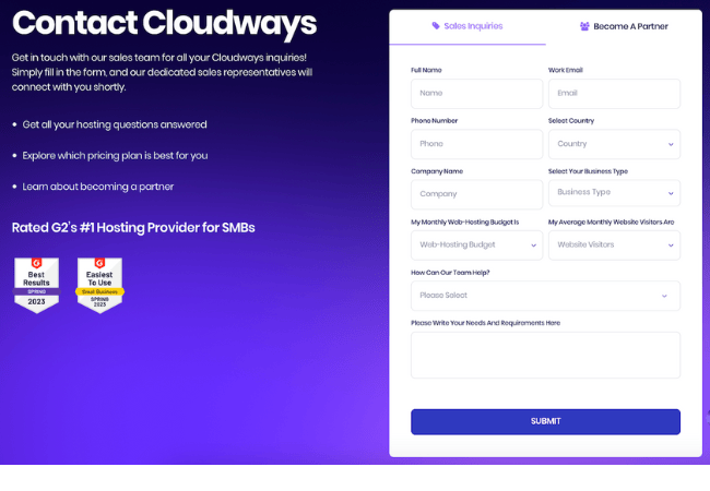
Cloudways' contact form is an excellent example of how a well-designed form can remove the pain of reaching out for sales inquiries or partnerships. It has a crisp, professional look and a calm color palette that matches the company's visual identity.
What makes it great?
- Obvious options: The form immediately offers distinct paths for sales inquiries or partnership requests.
- Asks the right questions: Every field is there for a reason, from getting the basics like your name and email address to understanding your web hosting needs.
- Clean and cool design: With its crisp layout and inviting color scheme, the form is as easy on the eyes as it is to fill out. And the call to action grabs your attention.
- Clear navigation: Dropdowns and well-organized fields keep things simple so users can zip through and submit without a second thought.
2. Mailchimp
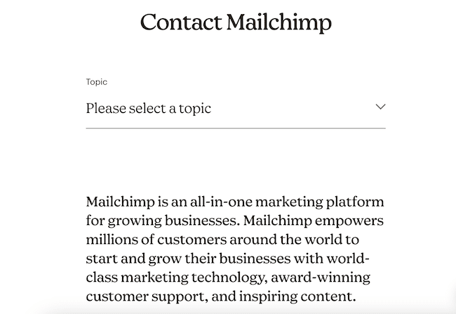
Mailchimp is a fantastic contact form example for sites that want to keep things simple, easy, focused, and efficient. It starts with a single dropdown, asking visitors to choose a topic. Users won't feel overwhelmed by showing one question at a time, and messages will instantly go to the right person.
What makes it great?
- Focused: The "Please select a topic" dropdown is prominent, ensuring users can immediately pinpoint their reason for contact.
- Streamlined design: This minimalist contact form design eliminates distractions and promotes a no-fuss experience, which aligns with Mailchimp's efficient service ethos.
3. Zendesk
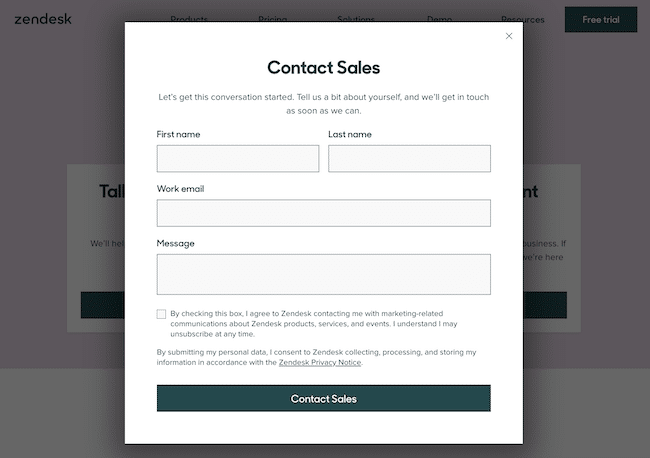
Zendesk's contact form gives users a quick and easy way for users to reach out to their sales team. It sticks to the essential contact information with no frills in sight. It's short, to the point, and still friendly.
What makes it great?
- Straight to the point: It's a shorter form with only three form fields and zero hassle.
- Uncluttered layout: The streamlined design eliminates distractions, so users stay focused on completing the form.
- Privacy info & email opt-in: It includes a checkbox for visitors wishing to receive promotions and newsletters while respecting user privacy and choices.
4. Kinsta
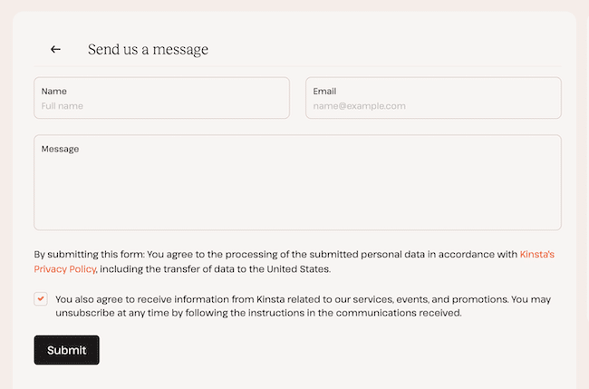
Kinsta takes a minimalist approach, too. Their beautiful form design makes it effortless for anyone who wants to get in touch. With an inviting "Send us a message" header, the form removes any potential for confusion or delay.
What makes it great?
- Short and sweet: This form only asks for name, email address, and message, so visitors can quickly hit submit.
- Stylish design: A soft color palette, clean lines, and lots of white — this is how a contact form should look for websites with an upscale audience!
5. Formidable Forms
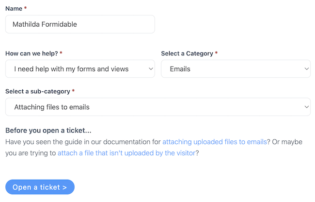
Formidable Forms has one smart contact form! Designed to get users help fast, it first asks a few simple questions, and then the AI offers tips and fixes. 🤖 If the bot's answer doesn't help, then customers can contact support.
What makes it great?
- AI field for customer service: A trained ChatGPT field directs users to related documentation to instantly get answers to common questions before contacting customer support.
- Clear CTA: The call to action at the bottom of the page tells users exactly what will happen next. A plain "Contact" button can leave them wondering whether it'll start a chat or send an email.

Create & customize a contact form in WordPress
Now that we have some design ideas, let's learn how to create a contact form for our WordPress website.
So, it's just a few steps to create and design a form:
Step 1: Install and activate Formidable Forms
The easiest way to create a Contact Us form in WordPress is with a form builder plugin. Our favorite happens to be Formidable Forms, so we'll be using it in this tutorial.
Grab the free version to get basic form-building features, or pick up our premium WordPress form maker for tons of templates and advanced fields.
Step 2: Drag and drop fields to build a form
In the WordPress admin, we go to Formidable → Forms and click the blue + Add New button. Then we can choose from over 300 form templates or Create a blank form.
Let's use the Contact Us form template today to make things faster. Once we've made our choice, we'll be taken to the form builder.
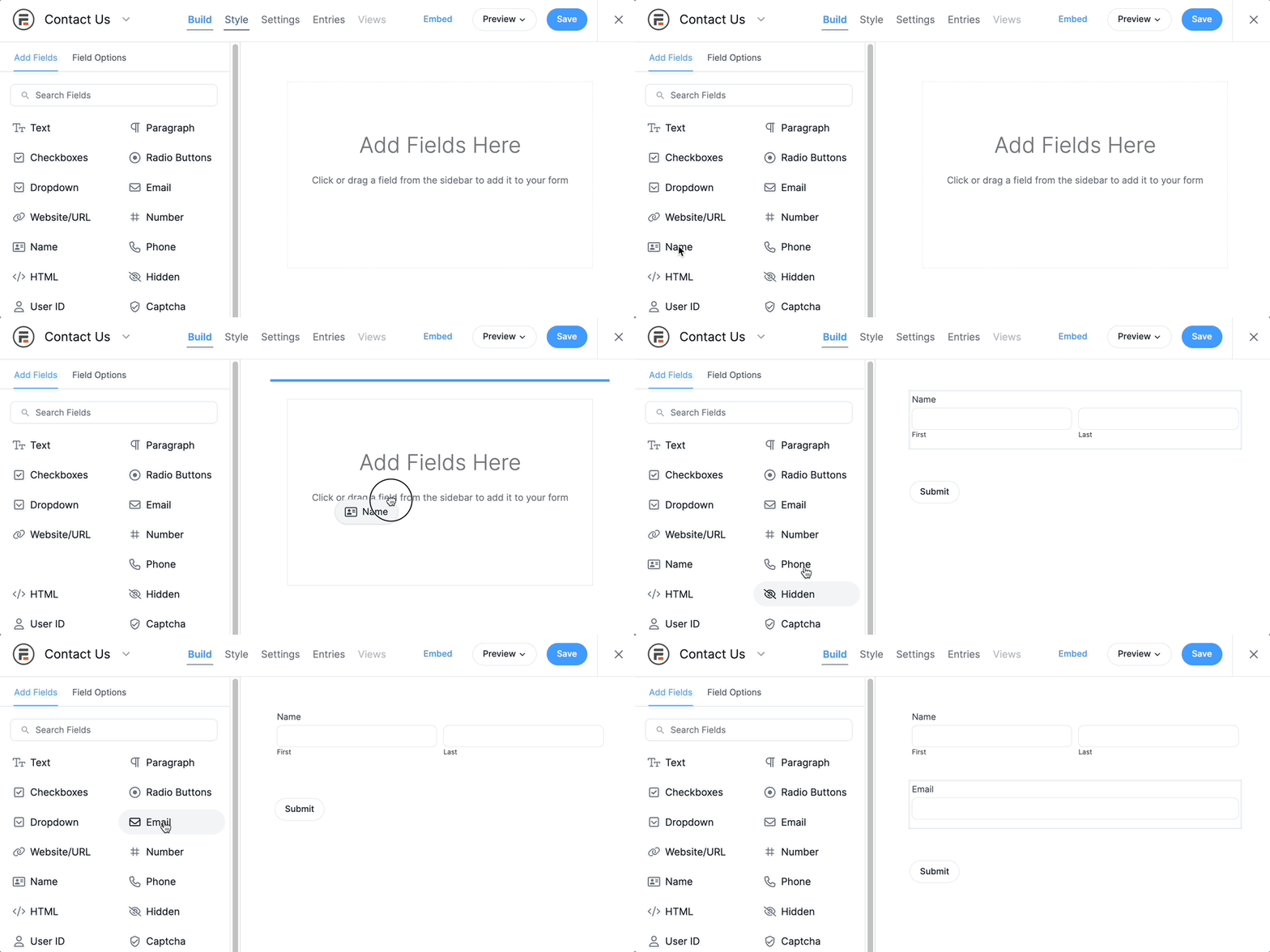
To add fields to our form, we click and drag them from the left side of the screen and over to the canvas on the right.
Once all our form fields are there, we click Update to save the form.
Step 3: Customize the contact form design
Now comes the fun part! First, let's open the form Style tab.

To create a style, go to Formidable → Styles. If this is your first time using the Styler, our plugin will set up a default Formidable Style template.
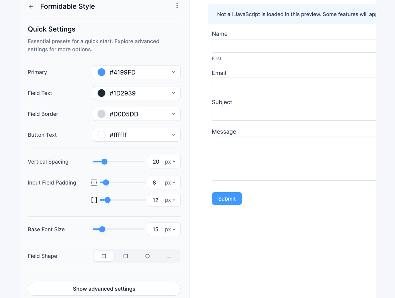
The menu on the left displays the style name at the top and all the customization options below.
There's a huge number of options, so we won't go over each one here. They're all covered in the Formidable Form Styler guide though.
But for now, let's look at the most common contact form design settings to personalize.
- General form design settings
- Field colors
- Checkboxes & Radio buttons
- Button style settings
- Custom CSS
Would you rather watch a video? Check out this tutorial on how to use the visual forms styler! 👇
General contact form design settings
Why don't we start with the most basic form styling settings? The General section allows us to adjust our form's position, width, margin, padding, borders, and background colors or images.
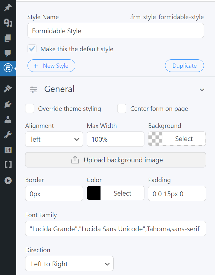
It also allows us to add Right to Left (RTL) text support to our forms. ⬅️
It's worth mentioning that when we change a setting in the General tab, it applies to the entire form.
Plus, any changes we make will appear in the live preview.
Field colors
The Field Colors setting changes the background and text colors of form fields. We can also choose colors to pop up when a field is active or if there's an error.

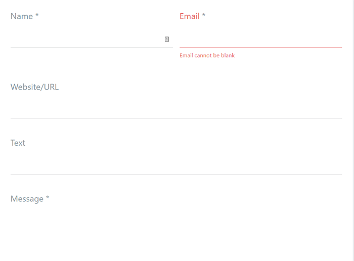
One of the most exciting ways to modify a form's style is to customize its borders. By changing the thickness and style of the field borders, you can create sleek-looking forms.
You could even get rid of the boxes on your forms altogether, like in the example below:
Check Box & Radio Fields
The Check Box & Radio Fields settings adjust our form's size, layout, and color of any checkboxes or radio fields.

By design, checkboxes and radio fields are usually very simple. But we can still make them pop in our contact form by using a different color, changing the weight, or switching layouts.
Button style settings
Buttons are probably the most important part of contact forms. They need an engaging call to action and look great because they aim to get as many clicks as possible!
🤔 Wondering what to say instead of "Contact Us"? A few we like include "Send us a message," "Request a call back", or even the simple "Say hi!".
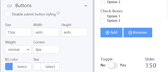
But a button is also the one contact form design element we can enjoy. It's a good idea for them to be bright and colorful to stand out.
To add a little pizzaz, change the contact form button color on hover.
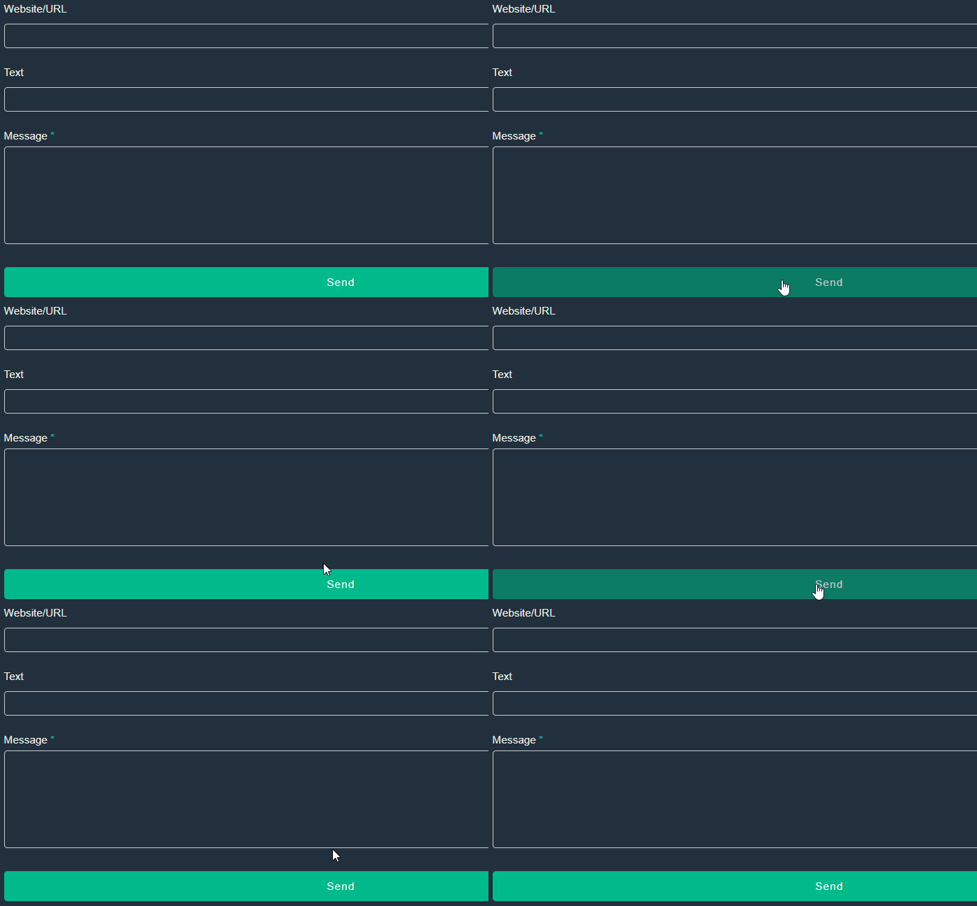
Custom CSS
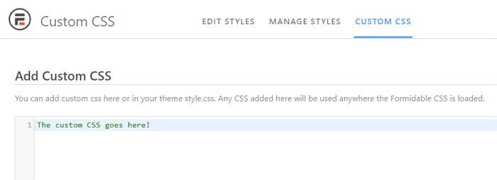
If you've been wondering, "How do you style a contact form in CSS?" This section is for you. With custom CSS, you can create any kind of creative contact form design you want.
So, if you're comfortable using CSS, the Form Styler can add custom code and style to any template. To do so, go to the CUSTOM CSS tab and tweak to your heart's content.
Want to get really fancy? You can also customize form HTML in the Form Settings tab.
Whew! 🥵 That's a lot of WordPress form design options! How about we stop tinkering and finally get our contact form online?!
Step 4: Publish the form
Last step! And luckily, it's a simple one.
We'll open our Contact Us page in and plop a new block into the WordPress page editor.
All left is to select the Formidable Forms block and our contact form from the dropdown.
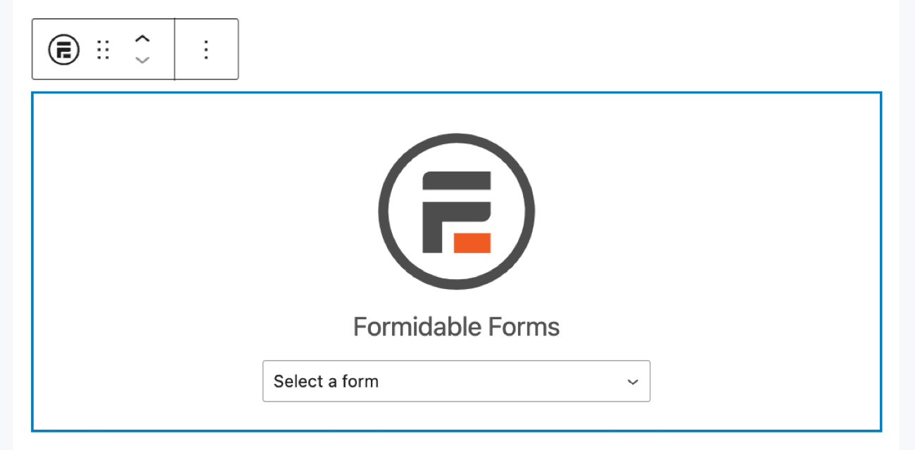
Then we'll update our page and ta-da! 🎉 The beautiful form we designed is up on the internet!
Ready to design a contact form for your site?
That's a wrap on designing contact forms that engage and convert! With Formidable Forms, you get an all-in-one WordPress plugin for creating forms that are as pretty as powerful.
Don’t stop at contact forms, though!
From making landing pages to creating calculators, there's so much more you can do with Formidable. Check out our WordPress blog for more ways it can help you make amazing websites.
And be sure to follow our social media accounts on Facebook, Twitter, and YouTube for more form tips!
 How to Change Contact Form Button Color in WordPress
 Conversational Form Design: Everything You Need To Know
 5 Best WordPress Portfolio Plugins for Powerful Design
Great article, always looking for tricks on styling.
I am trying to figure out how to change the "frm_color_block" color without having to style with CSS, I can style it this way, but I prefer not to. Can you please let me know how this color can be changed? I have gone through all style settings and every part of the settings and I cannot find where this can be changed. Thanks!
Hi there, We are unable to provide support here on the blog. Could you please contact our support team from our support page and they can point you in the best direction to accomplish what you are after.
Great article! I'm loving the inspiration for my own contact form design. The use of contrasting colors and clean typography really makes a statement. Can't wait to try out some of these ideas on my own website!